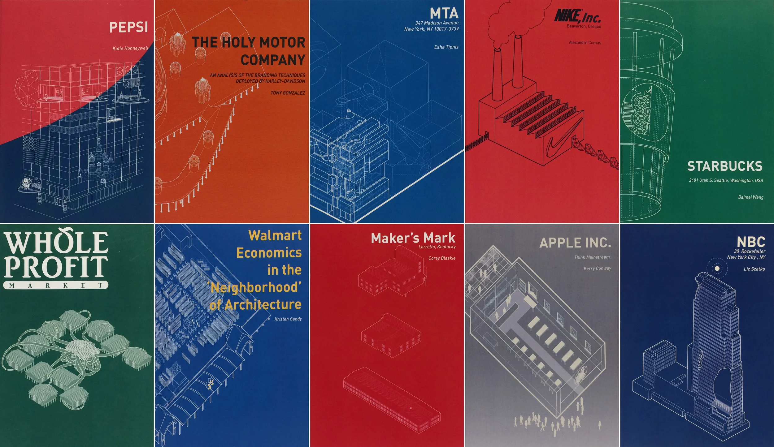
This graduate seminar probed into the complex relationship between branding + capitalism and architecture. A review the historical origins of capitalization through the evolution of economic systems through current theories about economics (agrarian, industrial, service, experience, and meaning), was compared to the architectural responses over centuries to these overlapping phases. The seminar began to critically examine the intersections between architectural semiotics, form, programmatic function and its role within the greater social landscape. Understanding the shift in architectural philosophies beginning with Industrialization's influence on the birth of modernism served as an entry point into revealing the complex and sublime messages that are transmitted by the corporation's influence over a consumer driven population. The utilization of Advertising and Architecture together to enhance capital growth was scrutinized.
The seminar examined the different architectural typologies present within a capitalistic agenda, corporate headquarters, factories, and retail spaces. A critical analysis of company histories, analysis of the architectural forms revealed theatrical platforms that portrayed a gradient of authentic corporate portraits. These investigations were then interrogated and "hacked" resulting in architectural sketches that revealed a more accurate representation of the corporations through an architectural lens.
Each student produced a pamphlet which presented their research and the brand-hacked architectural speculation.
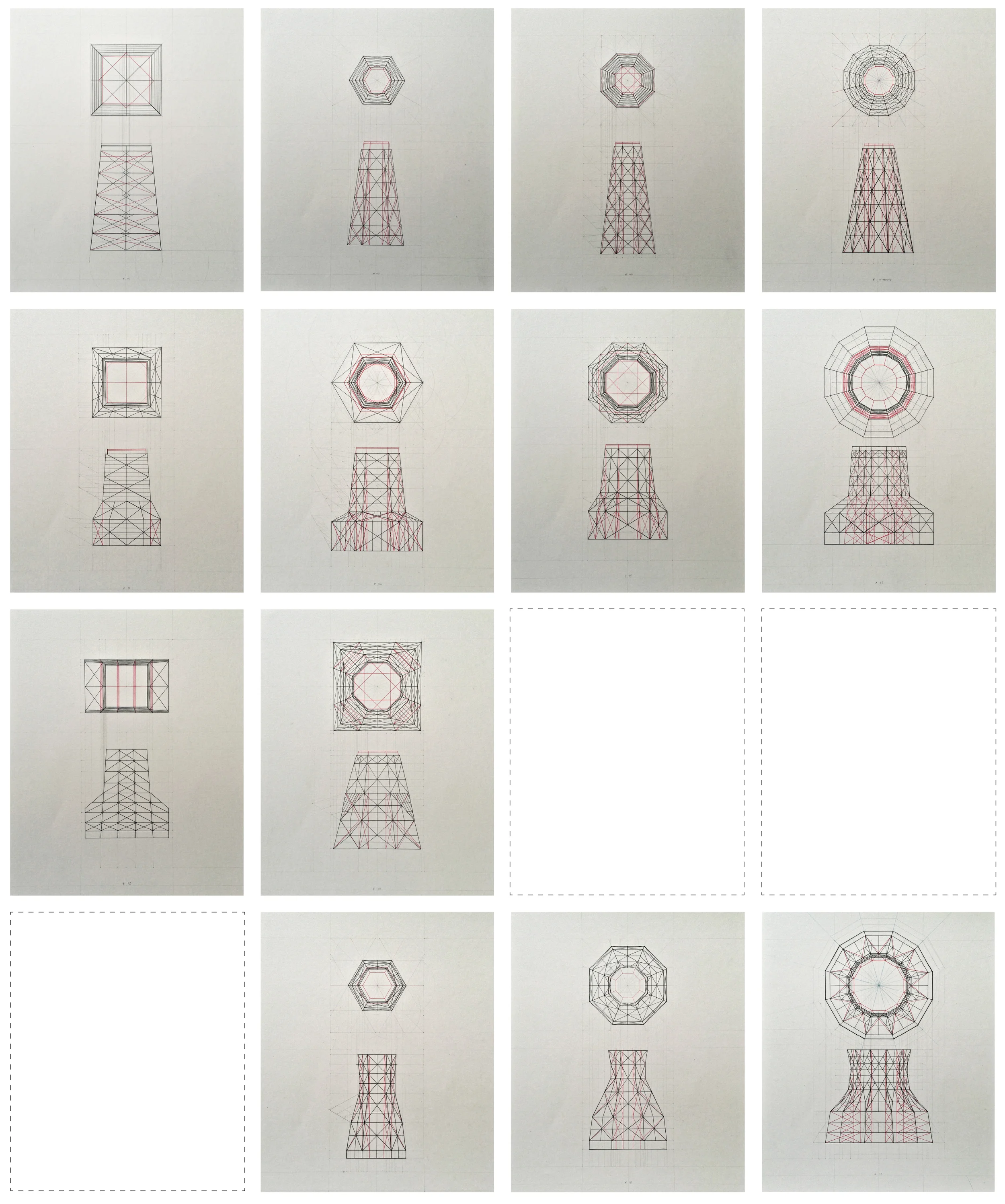
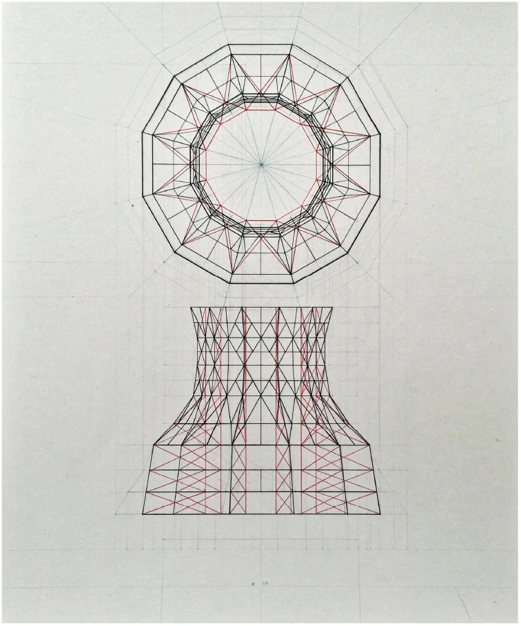
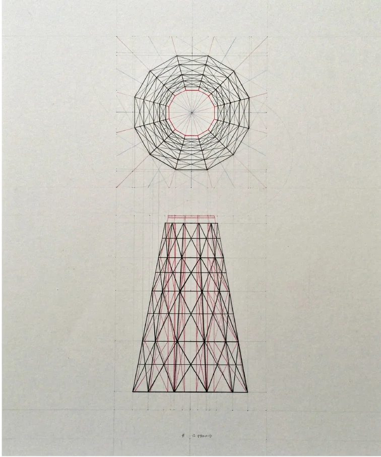
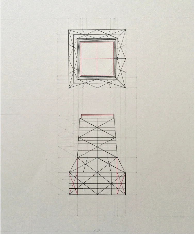
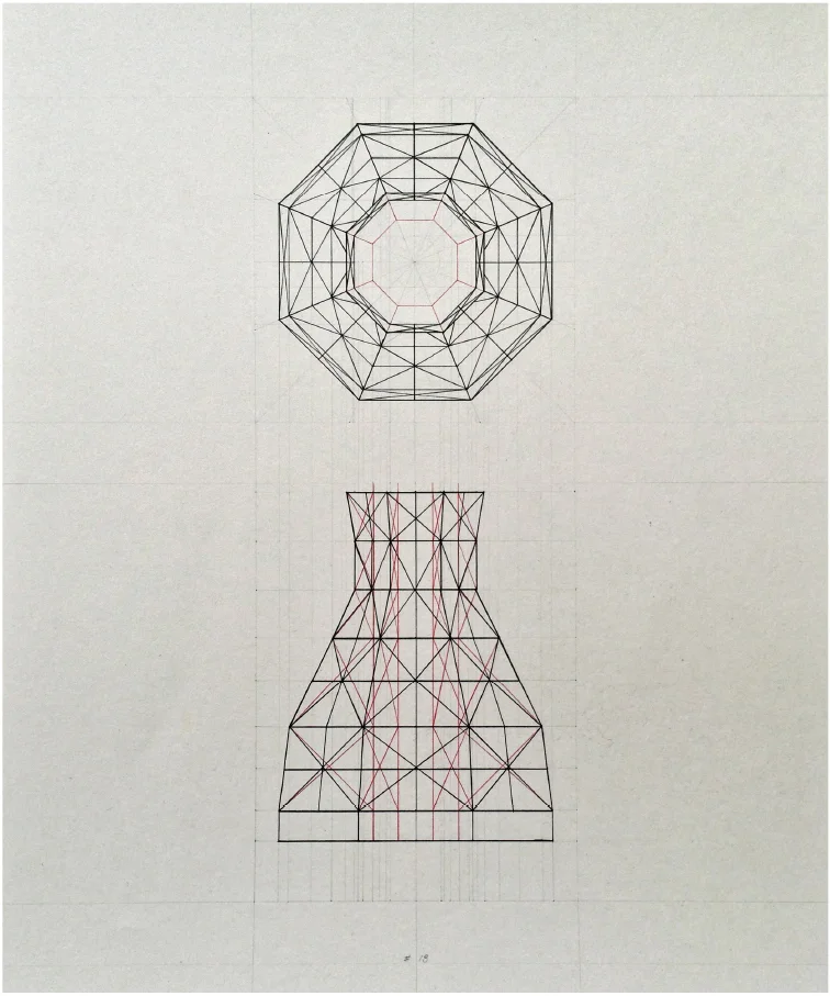
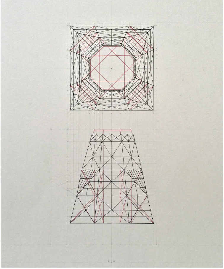
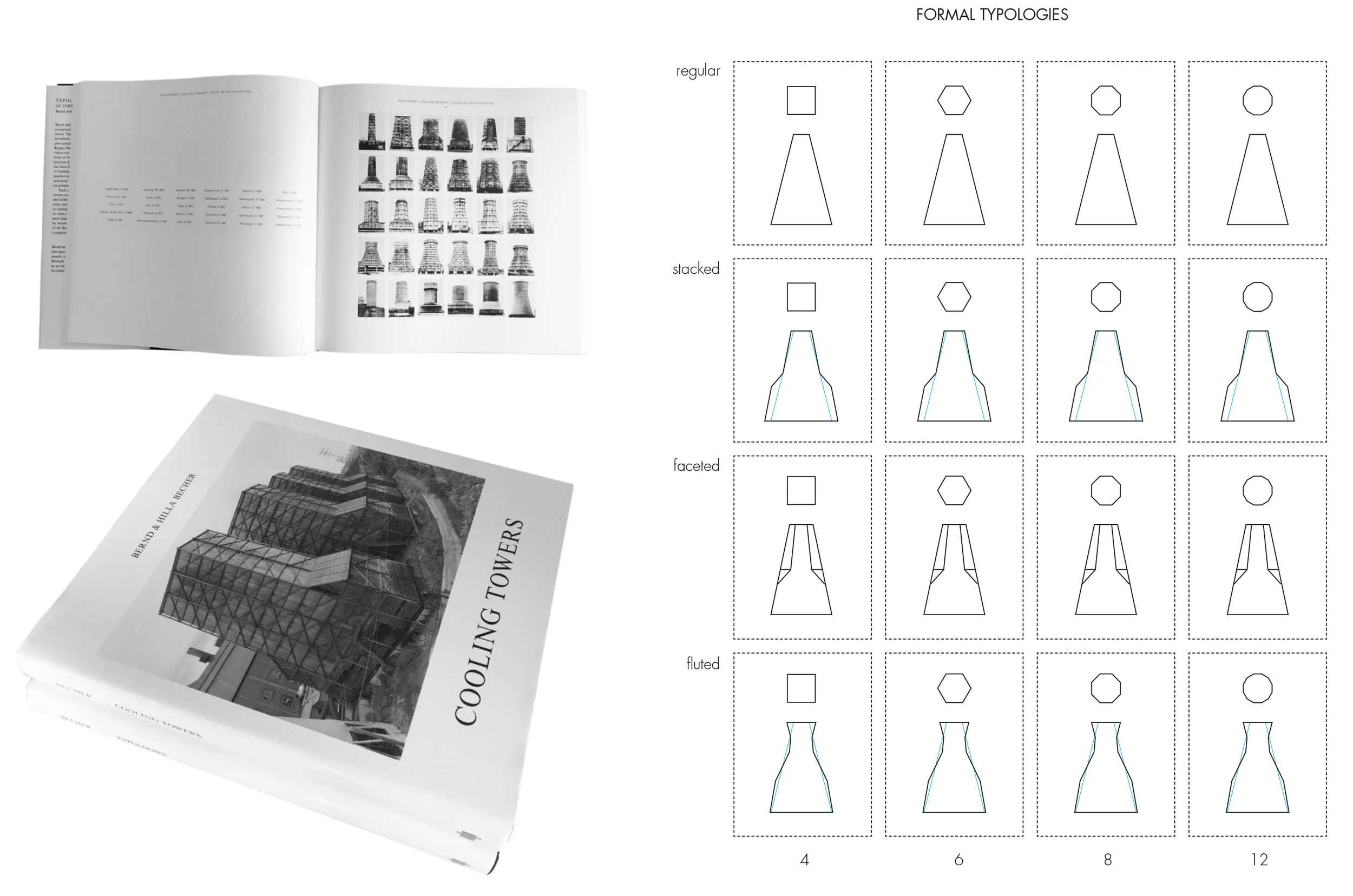
This drawing series of cooling towers represents a first step into analyzing the formal qualities of the industrial structures. A close examination of the structural forms documented by Bernd and Hilla Becher reveals a further level of typological categorization. This drawing series presents a collection of those towers in the manner the Becher's utilized during their typological exhibitions. Within the tabula rasa, the x axis shows the development of the structures' sidedness (or simply how many sides does the tower have), and the types of pyramidal forms (showing a range from regular pyramids to fluted pyramids).
These forms are derived from an evolution of form based upon physical properties and functional requirements of water cooling within industrial complexes. The photographs within Bernd and Hilla Becher's work were closely examined, curated and translated into hand drafted and geometrically constructed elevations and plans. There are gaps that exist within the tabula rasa which reveal typologies that were either dysfunctional or were not photographed by the Bechers.
Source:
Cooling Towers Becher, Bernd and Hilla, MIT Press 2006
#22
#12
#81
#18
#66
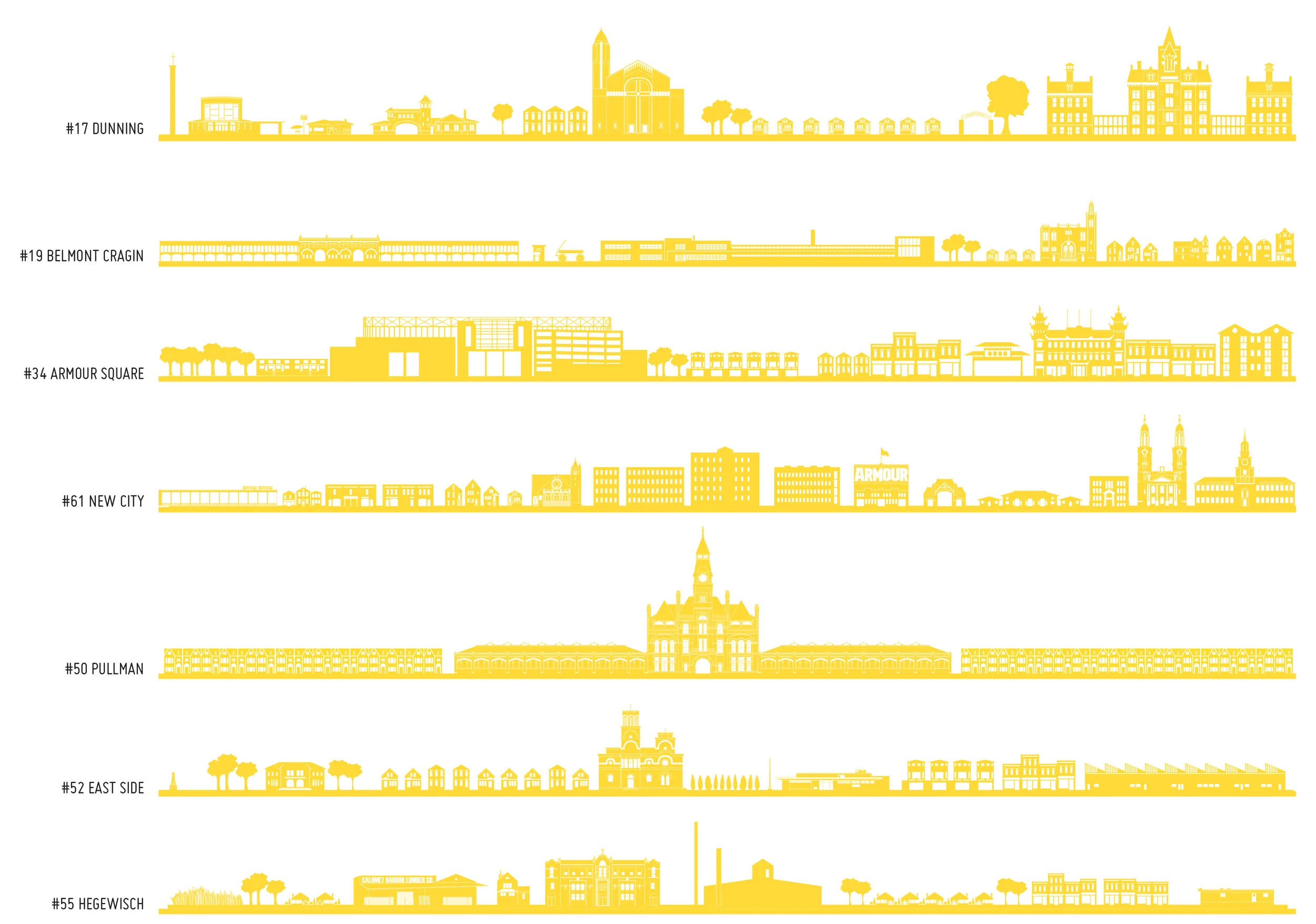
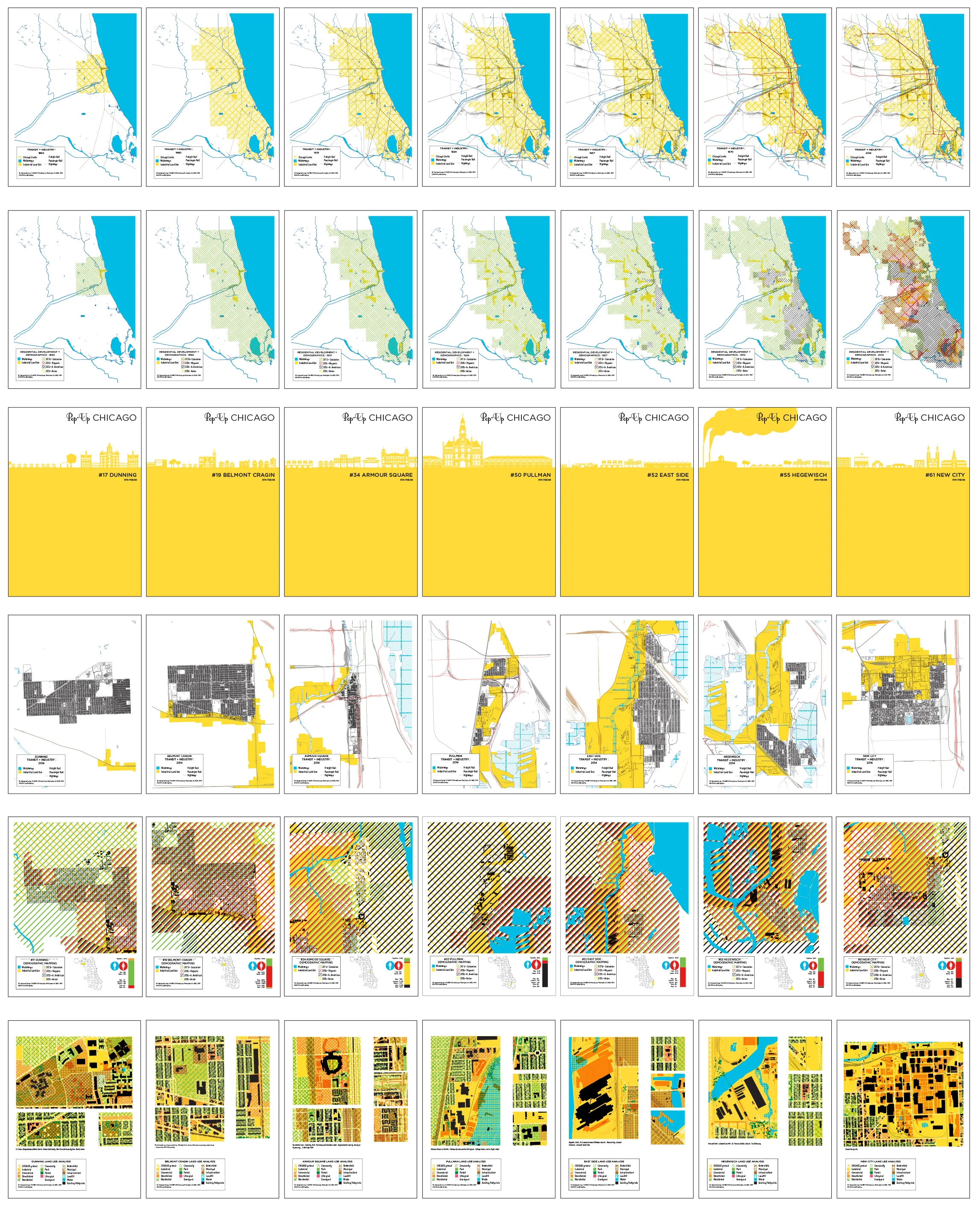
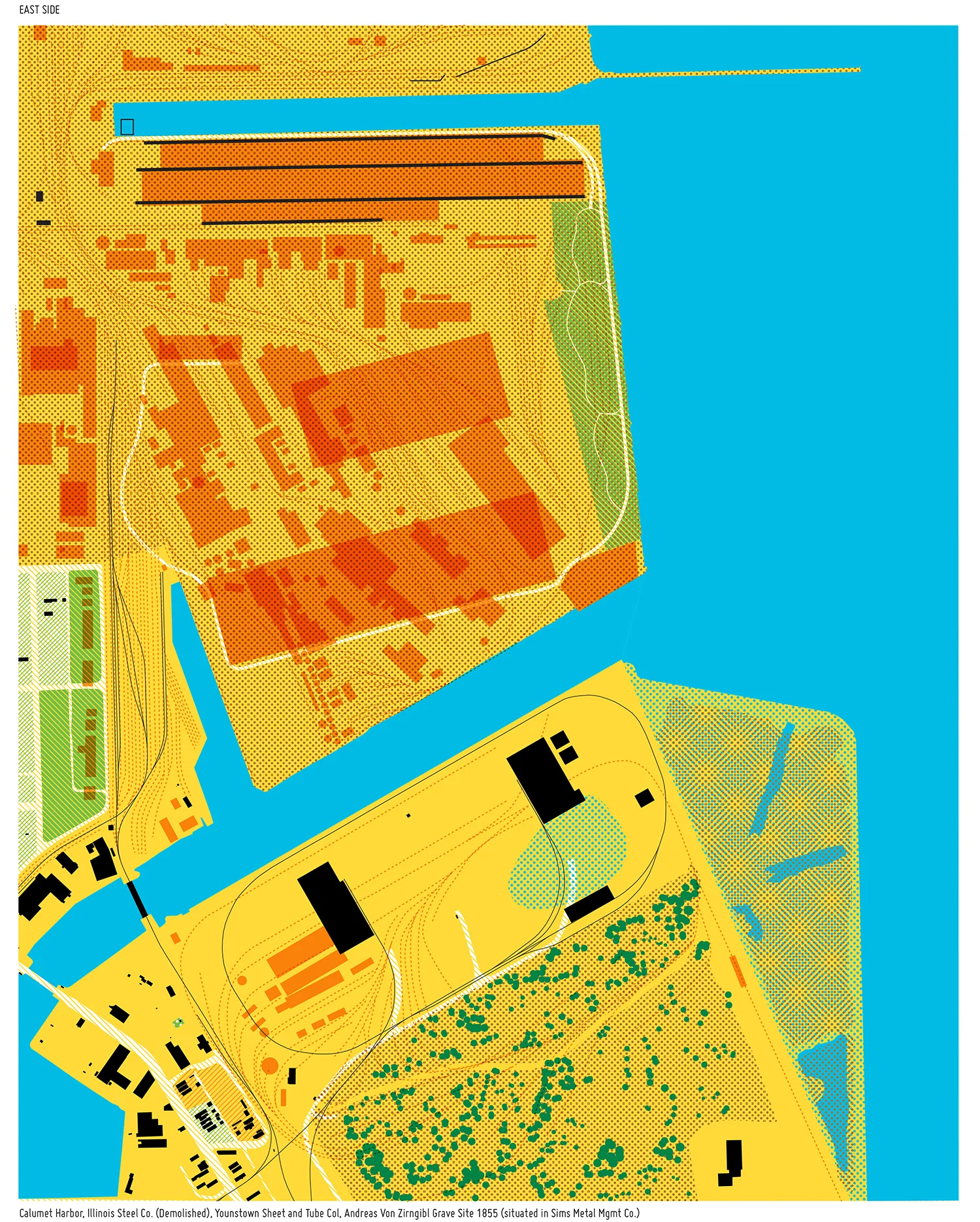
Pop Up Chicago’s genesis is rooted in the idea that while Chicago is known for its Iconic Skyline, it is also a vast city comprised of many unique neighborhoods which posses their own “genus loci.” An idea that suggests each has it’s own spirit of place which is born from the inhabitants, the natural and built environment, as well a historical events which breathe life into the narratives emerging from the combination of these elements.
In Chicago, as in other American cities, urban blight and renewal much of the residential landscape was shaped by the suburbanization of industry in the late 19th and early 20th centuries. Industries pushed out from central Chicago into the plains north of the city, and the wetlands to the south, formed magnets for new settlement. Many grew from the bottom up and a few were built from the tightly choreographed visions of the titans of industry. Nearly all attracted distinct groups of immigrants who not only imported their culture, they influenced the architectural vernacular of the communities adjacent to the factories. These new residential areas that “Popped Up” around the suburbanized industries grew up far from the heart of the city but within this interconnected web of industry and transportation. PopUp Chicago endeavors to honor the preservation of past and present constructed environments and branded identities by acknowledging and enriching the understanding of the connection between architecture, industry, and the people who built the great city of Chicago.
2014
Collaborators: Jennifer Harmon, Taubman College of Architecture + Urban Planning Seth Ellis, Stamps School of Art and Design
Team: Zach Angles, Lauren Tucker, Lauren Anne Wong
This Project was made possible by a grant from Alan and Cynthia Berkshire to Taubman College at the University of Michigan.
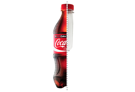
The object on the left is immediately familiar as a culturally iconic brand. Coca-Cola spent $3.3 billion last year on advertising intended to present this image of the Coke bottle to consumers as a pre-packaged, shelf-ready brand that is refreshing and priced to move.
The object to the right is also a Coca-Cola bottle. It received zero advertising dollars. Consumers are intentionally made ignorant of the existence of this particular Coke bottle because it exists in a perilous state before “brand,” caught in the ambiguous in-between stages of the manufacturing process in the factory.
The factory is dirty. It is not camera-ready. The factory is the underworld of brands, and the Coke bottle on the left works tirelessly to conceal any trace of its origins in this place. The pristine bottle in this image exists as a singular object that denies any methods of construction, whatsoever.
The Behind the Brand spring 2013 traveling studio sought to challenge brands on this very principle, taking on the hidden world of the factory as its primary pedagogical underpinning. These sites of industrialized mass production continuously undermine the familiar images that brands project. Singular objects of desire are suddenly revealed to be 1 of 1,000,000 units, and iconic fanciful product forms are subjected to the rigors (and constraints) of methods and sequences of assembly. Furthermore, factories engineer their own cultures of production that often exist in stark contrast to the brands they manufacture while simultaneously informing the contexts and landscapes where they are housed.
The studio traced the architectural lineage of manufacturing and branding beginning with the Industrial Revolution. Students traveled as industrial tourists and conducted an intensive study tour through Europe and the United States. The travel began in Coalbrookdale, England (the contested birthplace of the industrial revolution and manufacturing). Within the framework of the studio, teams of students were assigned a brand category (e.g. auto, chocolate, spirits, paper, pottery, etc.). Each European brand was paired and contrasted with an American counterpart. For example, "Team Auto" studied Fiat (factory in Torino, Italy, whose old factory has now been converted into a hotel while the new factory has a logo only visible from Google Earth), alongside Ford (in Dearborn, MI). The Spirits category studied Glengoyne Distillery, near Glasgow against and Maker’s Mark, produced in Loretto, KY in a dry county that allows the factory to manufacture a brand that cannot be consumed within the context. They were confronted with the images projected by their respective brands, but having studied the social, geologic, historic and economic realities present along with the role of the industrial architecture hiding in sheep's clothing. The students were able to study first-hand, what happens "Behind the Brand".
The primary means of documenting this process was conducted through the photographic notebook/journal and blog . The factories visited themselves pushed back against traditional modes of documentation. Many of these sites did not allow photography on industrial tours while others intentionally concealed certain aspects of the manufacturing process. Students were challenged to invent new means of recording information and constructing informative narratives for each product. At the end of their tour the students returned to the University of Michigan campus and recomposed their research in a graphically presentable format.
The Behind the Brand studio was able to move beyond the traditional classroom lecture format to provide students with an unprecedented opportunity to experience manufacturing cultures first-hand across a variety of industries and brand types in both the US and Europe. For these students, construction and methods of assembly no longer existed as abstract concepts. Rather, industrialized methods of production (the macro and micro environments they foster) had an indelible impact upon the manner in which these students worked and practice as architects. At the same time, the presence of architects within these factories purposefully sets up a tantalizing scenario of near-future industry-sponsored research and project collaboration.
The studio was lead by Jennifer Harmon with collaborator Teman Evans, generously supported by the Guido A. & Elizabeth H. Binda Foundation and sponsored by LSM of Washington DC.
A special thank you to our hosts including:
Historic + Cultural Sites
Ironbridge Gorge Museum Trust, Coalbrookdale UK
Youngstown Museum of Industry and Labor + Lanterman's Mill, Youngstown Ohio
National Park Service, Lowell Massachusetts
Milwaukee Art Museum, Milwaukee Wisconsin
Toledo Museum of Art Glass Pavilion, Toledo Ohio
Automotive
Tom Tjaarda, Torino Italy
Fiat, Torino Italy
Masseratti, Torino Italy
Ford Motor Company, Dearborn Michigan
Chocolate
Cadbury Foundation, Bourneville UK
Hershey , Hershey Pennsylvania
Glass
Waterford Crystal, Waterford Ireland
Libbey Glass, Toledo, OH
Furniture
Vitra, Weil am Rhein Germany
Herman Miller, Zeeland Michigan
Spirits
Glengoyne Distillery, Dumgoyne (Glasgow) UK
Maker's Mark, Loretto Kentucky
Woodford Reserve, Lexington Kentucky
Beer
Heineken Brewing Company, Amsterdam NL
The Best Place, Pabst Blue Ribbon, Milwaukee Wisconsin
Miller Brewing Company, Milwaukee Wisconsin
Pottery
Jackfield Tile Museum, Coalbrookdale UK
Broseley Pipe Works, Coalbrookdale UK
Wedgewood, Stoke on Trent UK
Pewabic Pottery, Detroit MI
Tour Bags, Field Guide (Itinerary) + Behind the Brand Badges
Coalbrookdale UK
Joe Chemello learning how to throw a pot with the artisans at Wedgewood Pottery.
Bourneville, home of Cadbury Chocolate's Factory in a Garden
In front of the iconic copper stills at Glengoyne Distillery.
The theater of production at Waterford Crystal.
Silodam, Amsterdam
Borneo Sporenburg, Amsterdam
Fully immersed in the tightly choreographed and hyper polished Heineken Brand Experience.
Inside Vitra's Furniture Assembly Facility.
Legendary Automotive Designer, Tom Tjaarda.
Resting in Jean Prouvé's Maison Metropole atop the old Fiat Lingotto test track.
Our "last supper" in Milano - al Fresco.
Video by Martin Elliot
Beer: Olivia Van Der Tuig + Annie Locke Scherrer + Madelyn Wiley
Automotive: Kathryn Drietzler + Sergio Escudero
Furniture: Luke Rondel + Martin Elliot +
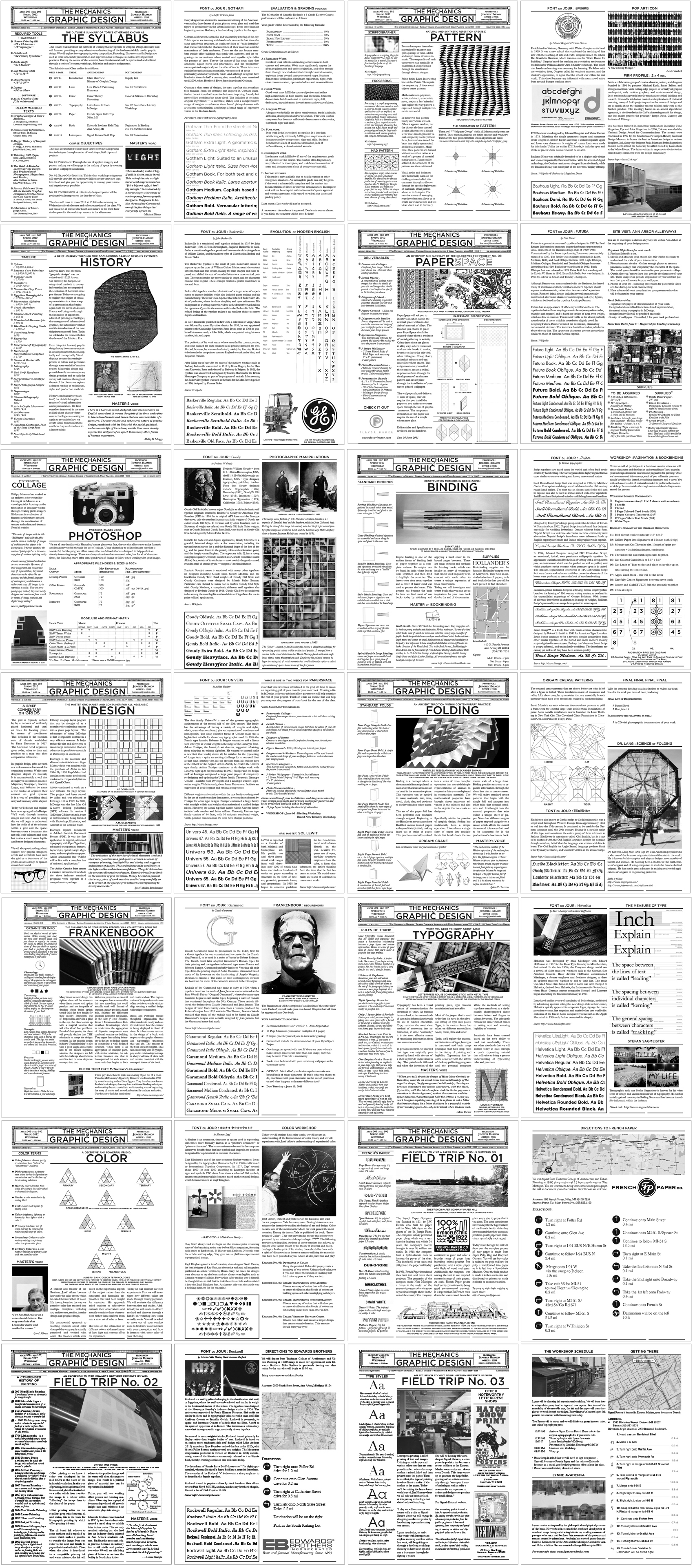
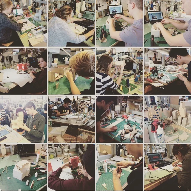
Mechanics of Graphic Design is a graduate seminar that I crafted after recognizing the need for providing graphic design education within the architectural curriculum. Frustrated by the lack of understanding and facility that students have with producing representations of their work and portfolios, the course emphasizes the materiality of the production of visual artifacts. Weekly lectures are combined with a project that builds in complexity over the course of the semester as well as field trips that introduce vital concepts to understanding the components that craft graphic design.
The basic components such as composition, the grid, typography, history of graphic design, introduction to color theory, and patterning among other themes provided the students with the necessary tools to effectively employ visual design. Three field trips introduce the essential combination of all of the components. We begin with a trip to the French Paper Company in Niles MI, a family owned company that produces a high quality paper using sustainable practices. A trip to Edward Brothers in Ann Arbor, MI allows the students to witness offset, digital and web presses producing printed journals which are also bound on site through very intricate machinery. This visit in particular serves as a kind of rosetta stone to understanding why design standards exist and how to properly anticipate their usage. The third trip to Signal Return in Detroit allowed the students to engage with the highly tactile practice of hand setting type and to operate letterpresses.
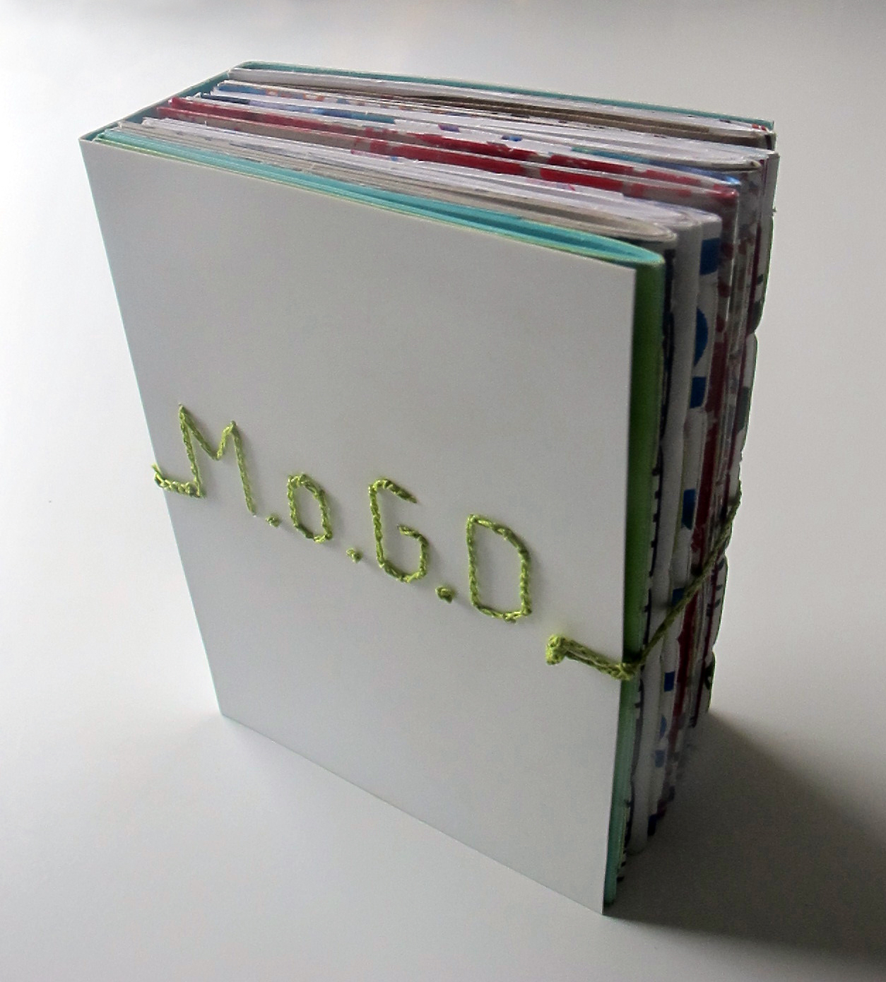
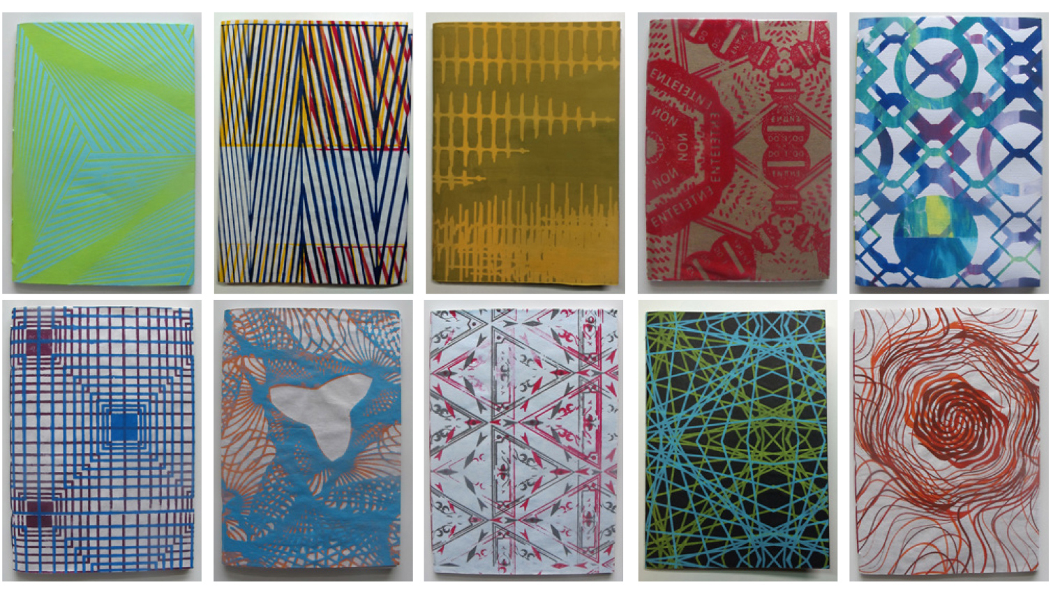
Additionally, the students investigate patterning through a project that produces a full scale wallpaper using seriography (silk screen). The product is installed in chosen alley in an urban context. This investigation questions the role of territories and branded spaces. (A project's success is gauged by controversy and/or delight.) The students are required to document their process and are given a set of strict criteria for producing a collective publication.
Course Handouts : Each provided a general summary of the daily course schedule, an overview of the daily theme, course assignments and links to access further information on the topics discussed in class.
Visiting French Paper Company in Niles MI.
Booklets: covers produced from "Paper Space" wallpaper samples designed and printed for the course - collectively bound in a hand crocheted polystyrene cover.
Student Booklet Example:
"Homeless Paper Space" by Sergio Escudero
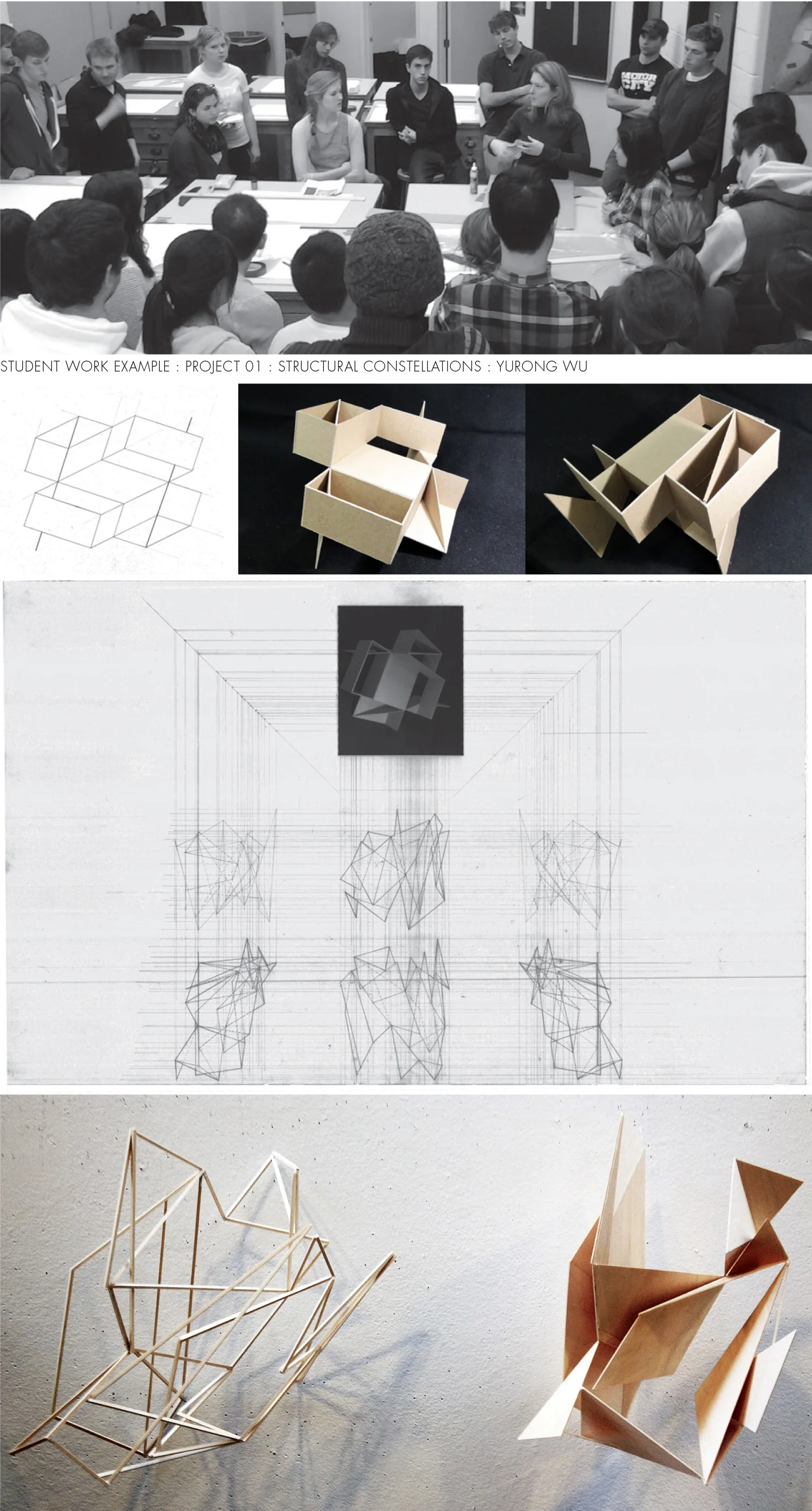
The undergraduate architecture curriculum at Taubman College of Architecture establishes the architectural design studio as the core pedagogical foundation. The students at Taubman college begin with introductory architecture courses in their freshman and sophomore years and are fully matriculated into the architecture program at the beginning of their junior year in college. The first architecture studio (UG1) puts forth a set of four spatial problems that culminate into a fully designed architectural proposal by the end of the semester. The course is typically coordinated by a senior faculty member and taught in tandem with one professor per ten to twelve students. Each individual professor has the jurisdiction to design each of the four problems specific to their own teaching methodologies.
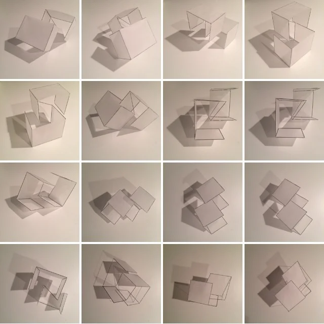
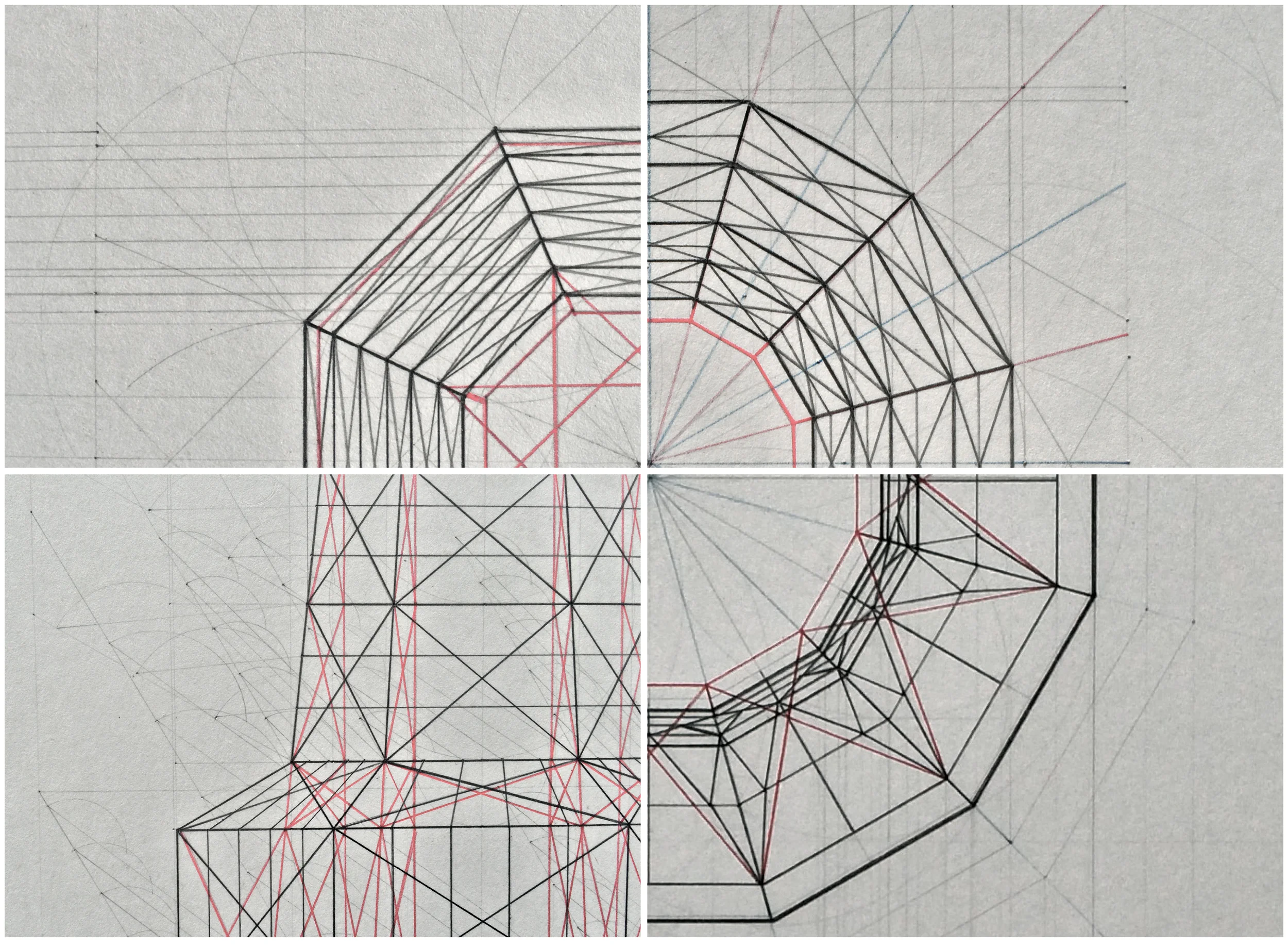
For this studio, the students began by closely studying Josef Albers' structural constellations. Asked to interrogate the role of the line and the ambiguity of spatial boundaries in Albers' drawings, the students began to generate three dimensional constructs that would directly challenge the perception of space.
+ The first project began by generating abstract spatial constructs based upon Alber's structural constellations. Using piano wire and trace paper to translate the perceptions observed in two dimensional space into three dimensions. The constructs were then placed upon cyanotype paper (primitive binary photographic method) and exposed to sun. The resulting shadows were then interpreted as space and subtracted from a defined volume and constructed by generating sections cut into hundreds of layers of museum board.
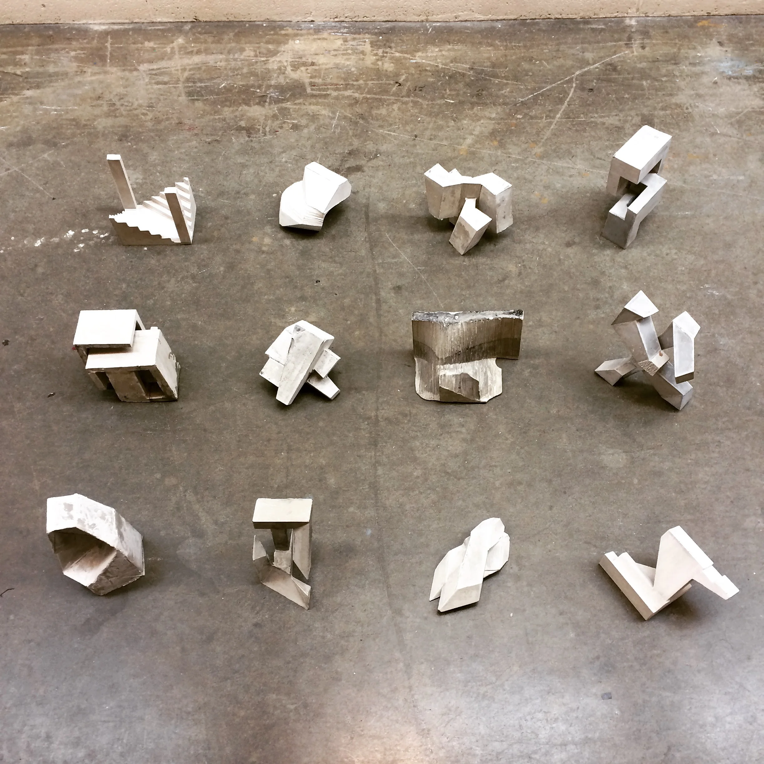
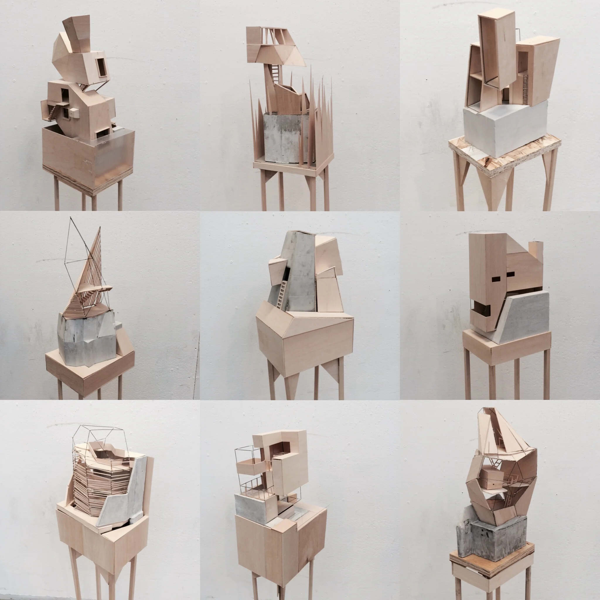
+ The second project The volume was inverted through casting the void generated in the first project. This allowed the students to recognize the dynamic role of solid void relationships, light, texture and basic techtonics within the construction of rockite (concrete) formwork.
+ The third project translated the abstract concrete forms into small architectural proposals, namely an artists cabin. Students were required to design two simple spaces with a connecting corridor between them. Their models were made from casts foundations, soldered wire frame structures and clad with basswood. This was instrumental in teaching the students to think about construction logics and understand material sensibilities.
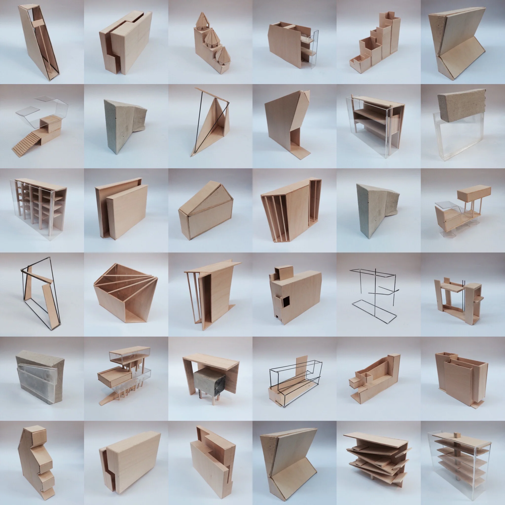
+ Project four repeated many of the same themes as project three, but it challenged the students to consider a much larger and more complex program in a legitimate site located in Ann Arbor, MI.
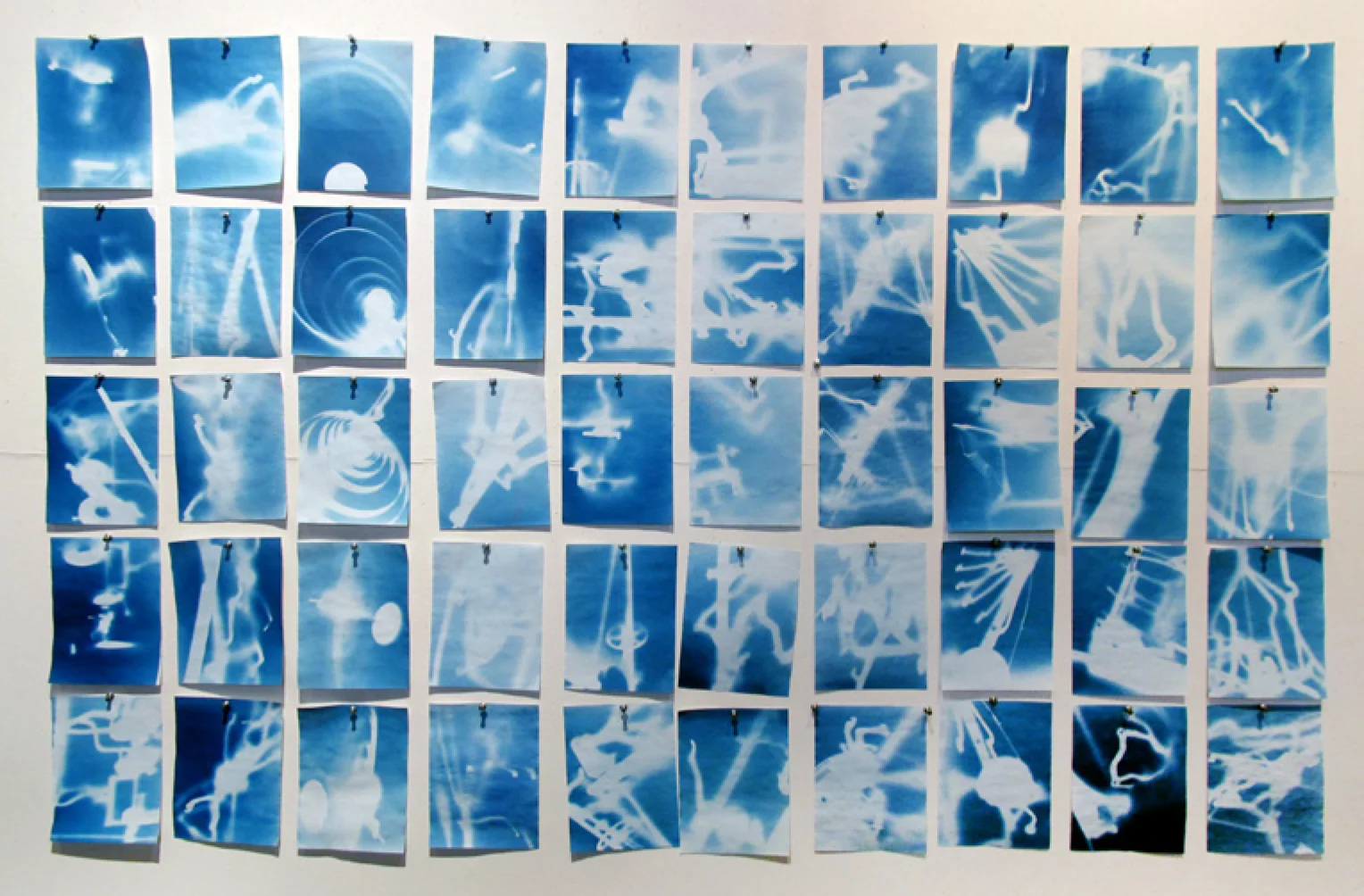
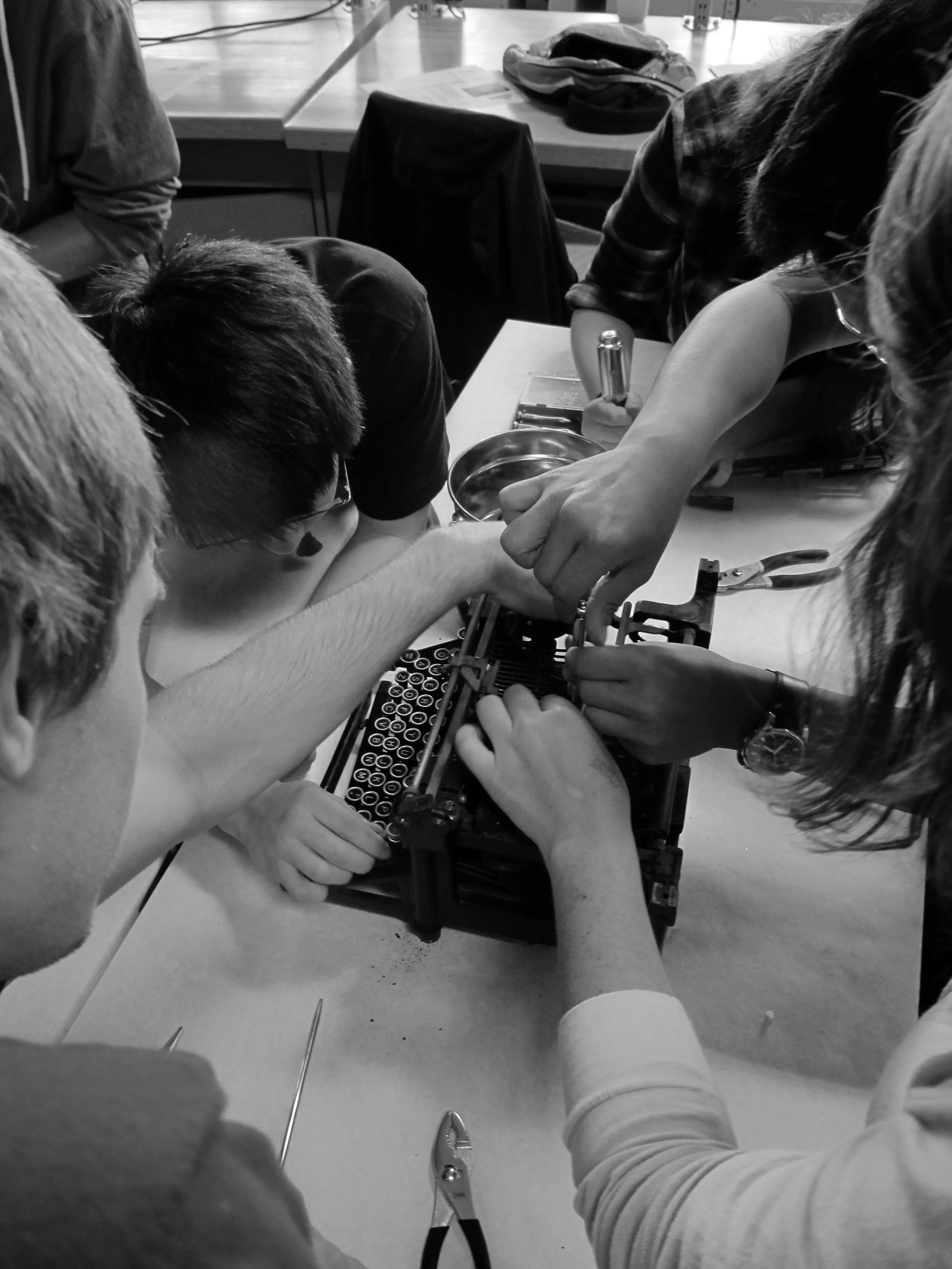
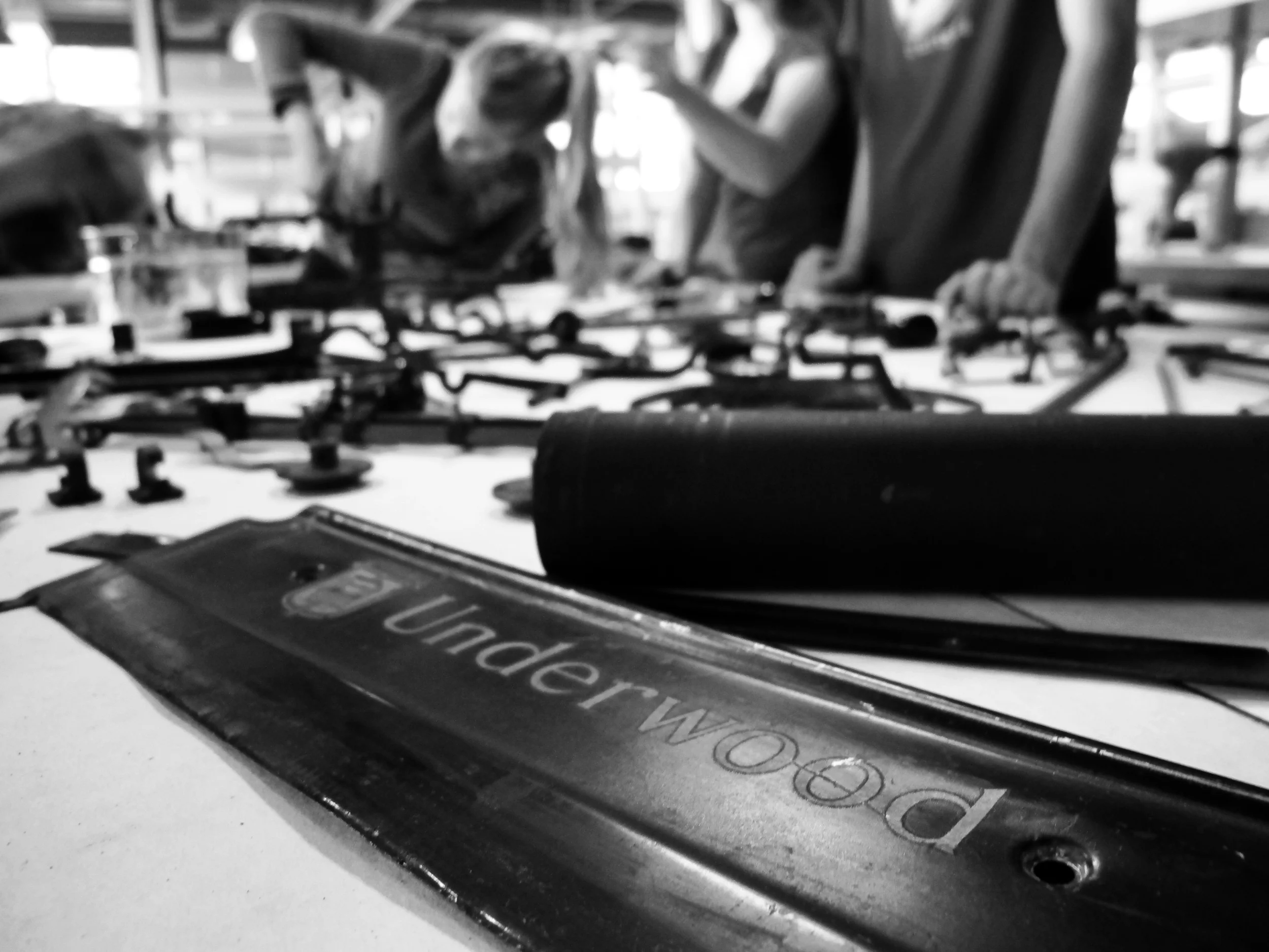
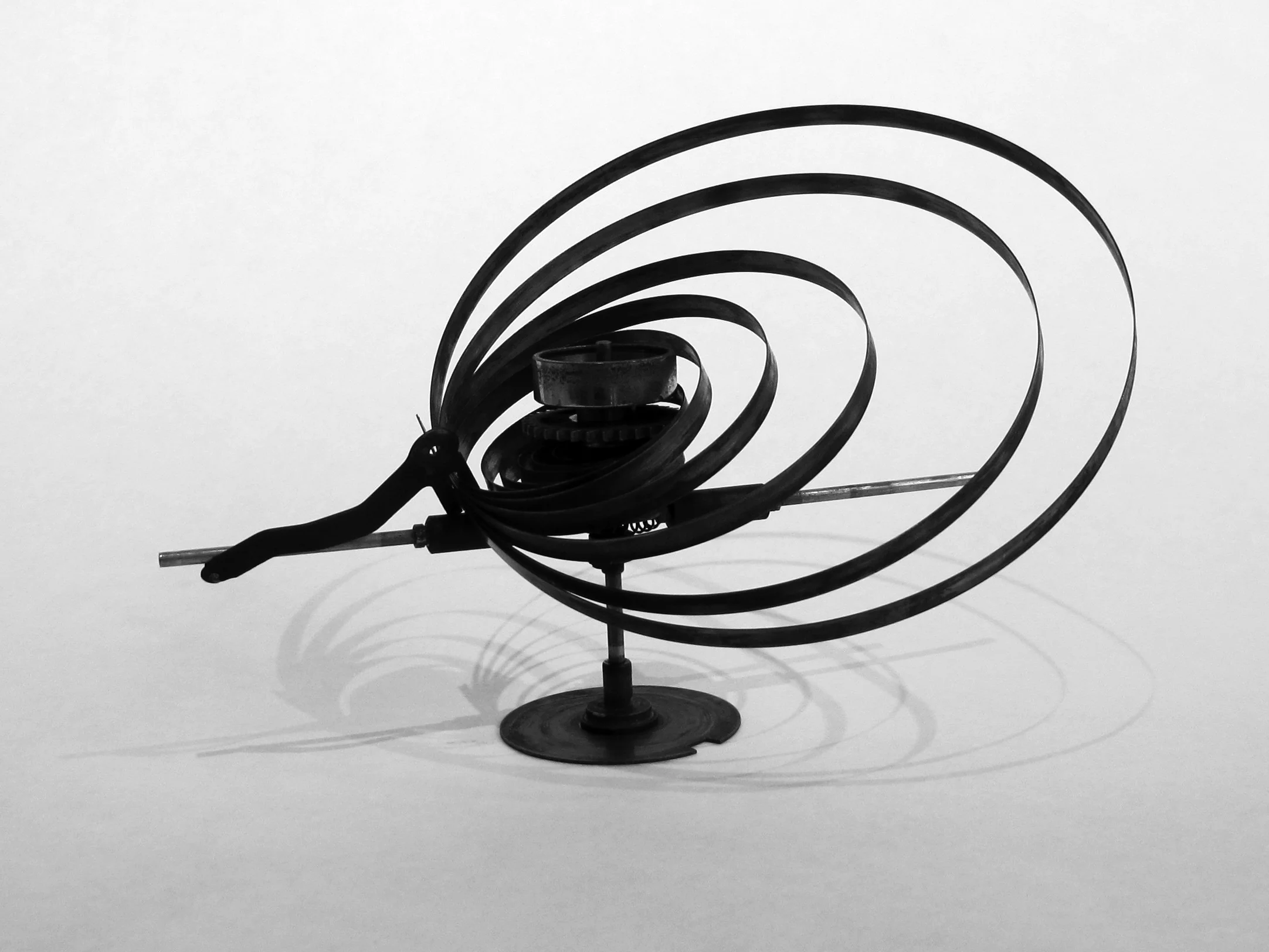
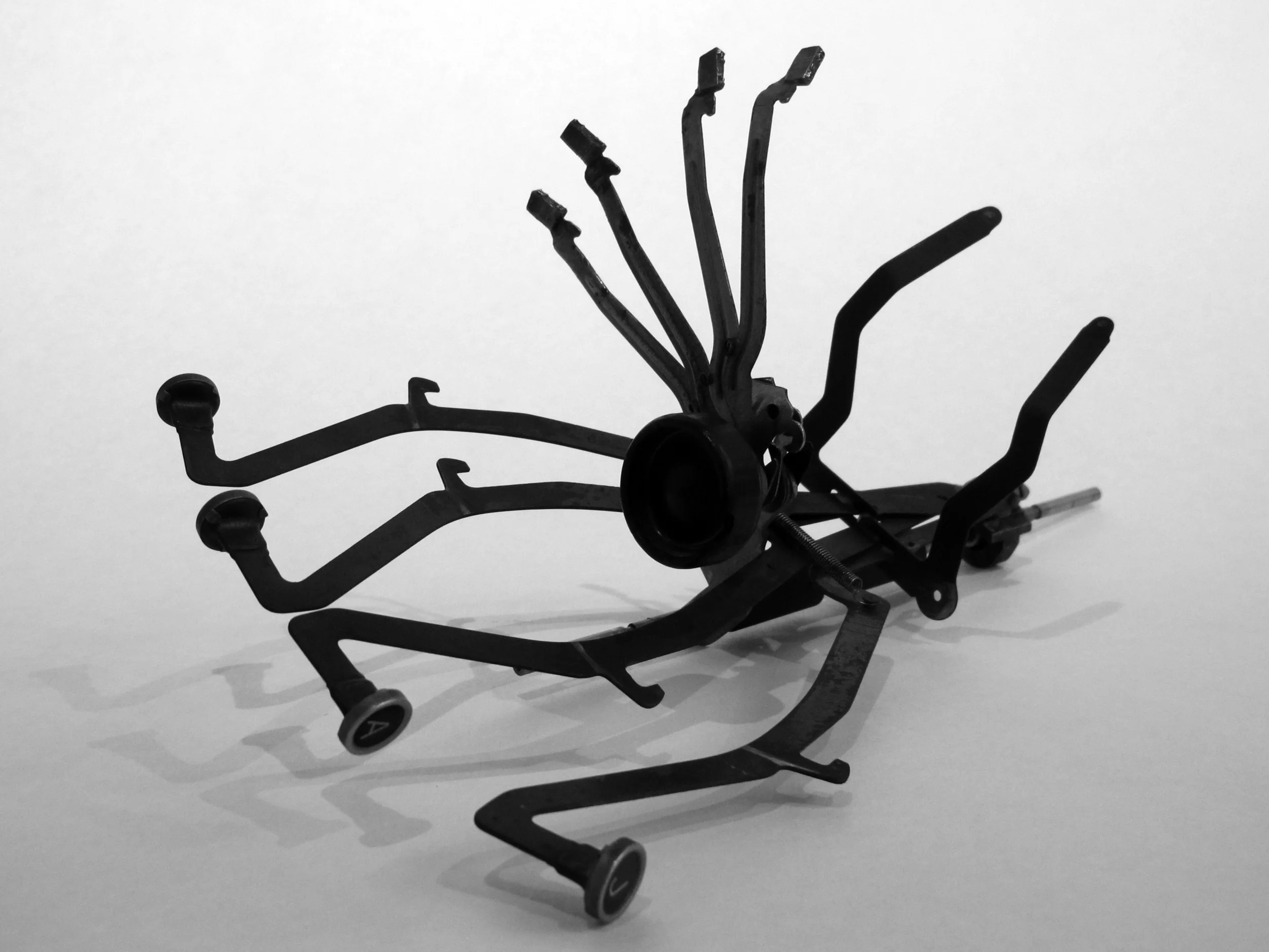
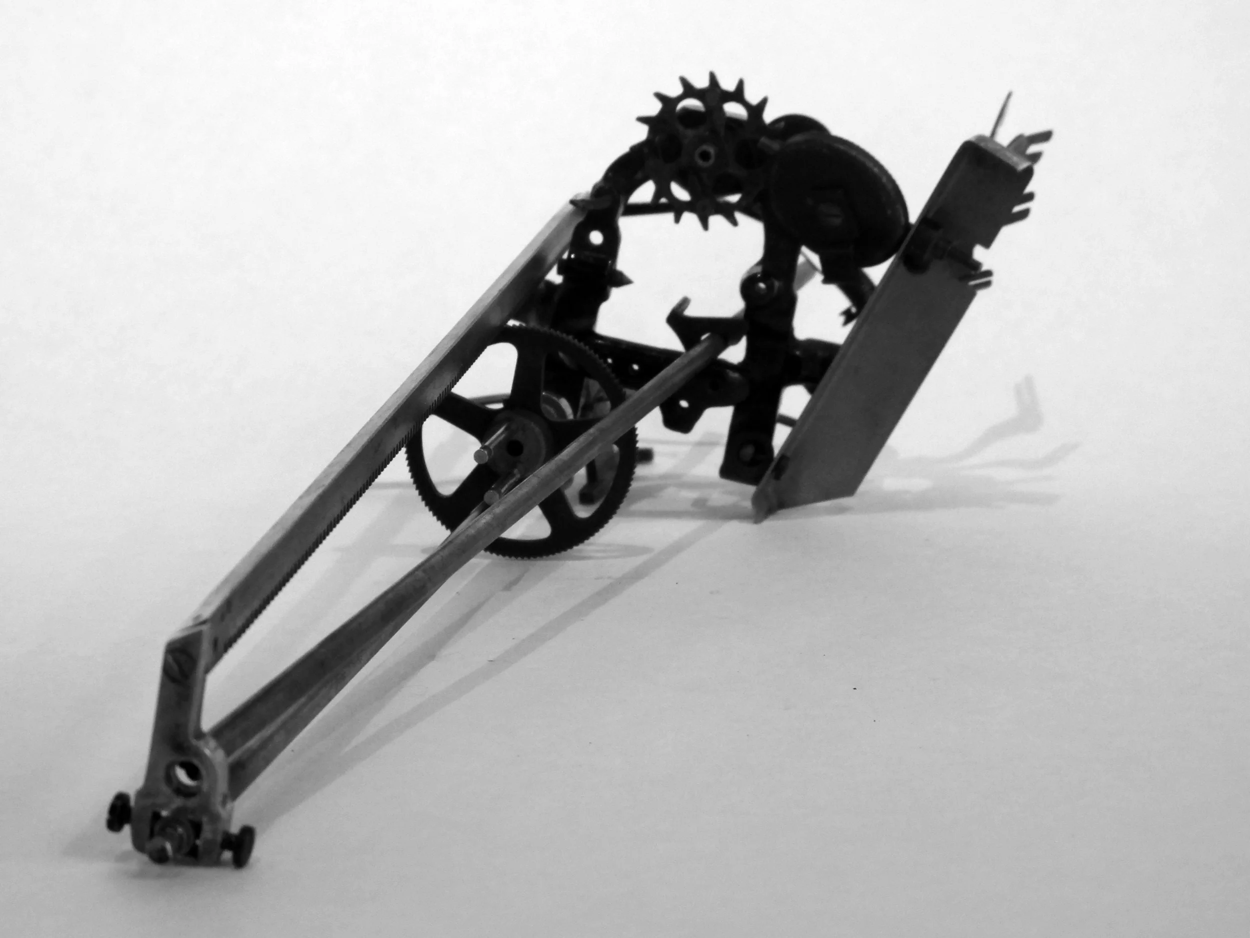
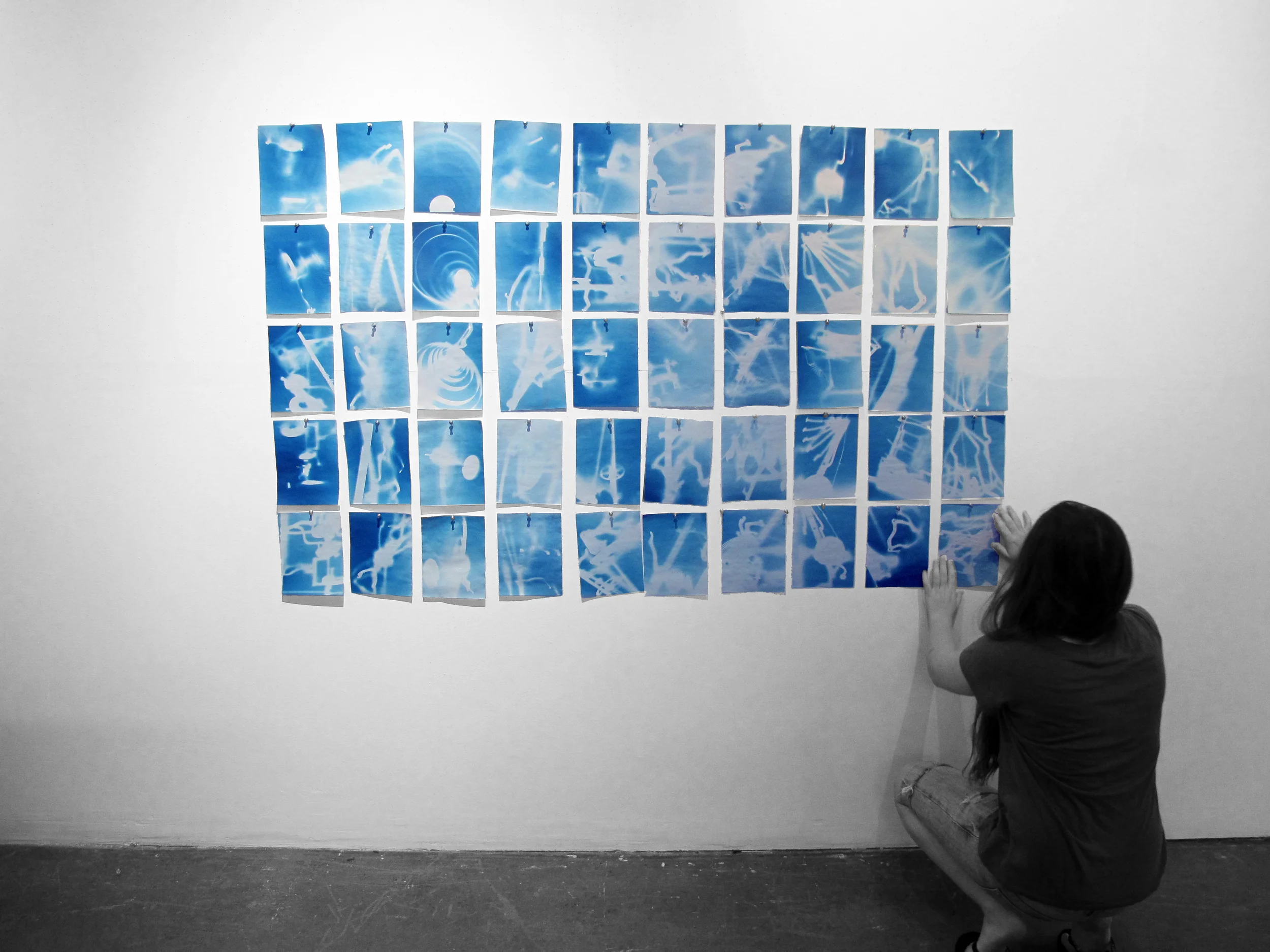
A group of first year architecture students were presented with an old typewriter and were instructed to document the disassembly of an vintage Underwood typewriter. The abstract forms provided by the parts, were utilized to produce eleven constructs, each bricolaged study was employed to generate a series of 5 cyanotypes per student. The final product, a tabula rasa of 55 cyanotypes.
All images and content copyright 2016.
This course seeks to produce more than the visual representation techniques that have been historically promoted by hand drafting. It promotes analog thinking before digital practice. After teaching the course twice I rewrote the syllabus, the course structure and generated new projects. The fundamentals this course teaches are essential skills for comprehending the concepts at stake in digital production of representation and fabrication. The course seeks to teach the fundamental skills required for contemporary practices that translate into the digital realm. It begins with an intensive workshop which is replicated (in much smaller scale) at the beginning of each project that follows as a means to provide the necessary skills and thinking required for each project. The course is structured as follows:
Descriptive Geometries: A workshop intensive is conducted for the first three weeks of the course. A series of rigorous exercises generated from the pragmatic work of Frederick E. Giesecke and the conceptual work of Josef Albers is combined to provide an understanding of craft, line work, hierarchy and a conceptual understanding of how line weights and types generate a visual language.
Orthographic Projection: This phase begins with a object that is generated through an iterative exercise using origami folding techniques. The work of Paul Jackson provides a logical explanation and understanding of iterative thinking through making folded tesselations. This vehicle provided the impetus to ask the students to generate their own tesselations which created spatial constructs that develop over time. Each fold distorts the surface of the paper. Those folds and steps are recorded through orthographic projection in plan, elevation and section, each iteration is created on top of the previous iteration which in turn creates a conflated drawing that tracks the deformation of the original sheet. Line weights and types become readily understood through their utility in this project.
Parallel Projection: The students are asked to locate mechanical objects that can be dismantled. During their search they are put through another workshop that introduces them to parallel projection. Once they have acquired an object they are asked to generate orthographic projections of its surfaces which are then used to generate an exploded axonometric drawing of the object’s assembly.
Perspectival Projection: The final project lightly introduces perspectival projection to the students. After walking through campus and identifying how perspective works in the field, the students are provided with drawings of the small residential work of Atelier Bow Wow. From these drawings they must produce a perspectival drawing that utilizes the concepts they have learned form their initial workshop.
This introductory architecture course begins with a thoughtful investigation into the role of the line within drawing and how it communicates spatial information. Initially, this sounds like an easy prospect for the students until they are met with the genius of Josef Albers Structural Constellations. This deceptively simple investigation becomes the foundation for the entire course in that the questions it provokes transcend representation and engage the spatiality of drawing. The translation of two dimensional representation to three dimensional, physical constructs which are then compressed and abstracted further into the two dimensional realm multiple times.
The study begins by recreating the structural constellations that Albers generated. These drawings are translated into spatial constructs which rely heavily on the interpretation of the independent and the relational characteristics of the lines within the drawing. Those constructs are photographed and flattened again, drawn upon and then reconstructed as complex wireframe and planar models.
Project two asks the students to conduct a case study of an iconic Japanese building. The students are required to study the spatiality of the building, understand the motives behind the design intent and articulate three concepts that lead into spatial design decisions. The research results in a carefully drawn set of plans, elevations and sections which should be carefully composed on a series of sheets. The conceptual analysis is provided through a written narrative which helps the students articulate the ideas using the architectural lexicon.
Half of the class is provided with a modern Japanese building and the other is provided with a historically rich building - the traditional building. The buildings are then paired according to similarities in their typological forms., ie: Pagodas are paired with tall buildings, communal vs private residential buildings are paired, enclosed vs open buildings are paired. The projects begin by locating similar design themes and are asked to generate a new building based upon the ‘mashing’ of a modern building with a traditional building. They must also produce a thoughtfully written argument as to why they made the formal and design decisions.
The final project asks the students to generate their own tea house or sukiya based upon one of the fundamental concepts they investigated within their previous study and use this as a primary driver for designing a small building for contemplation. The students are introduced to site analysis and survey and must take into account the spatial constraints and character of the site. These are represented through models and orthographic drawings.