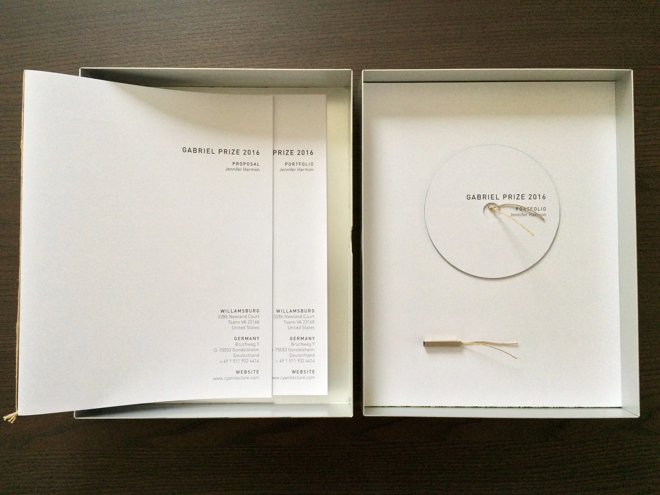
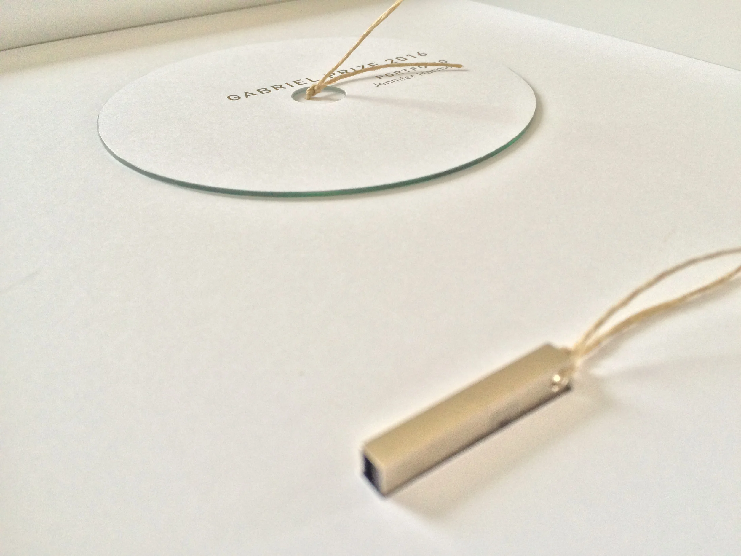
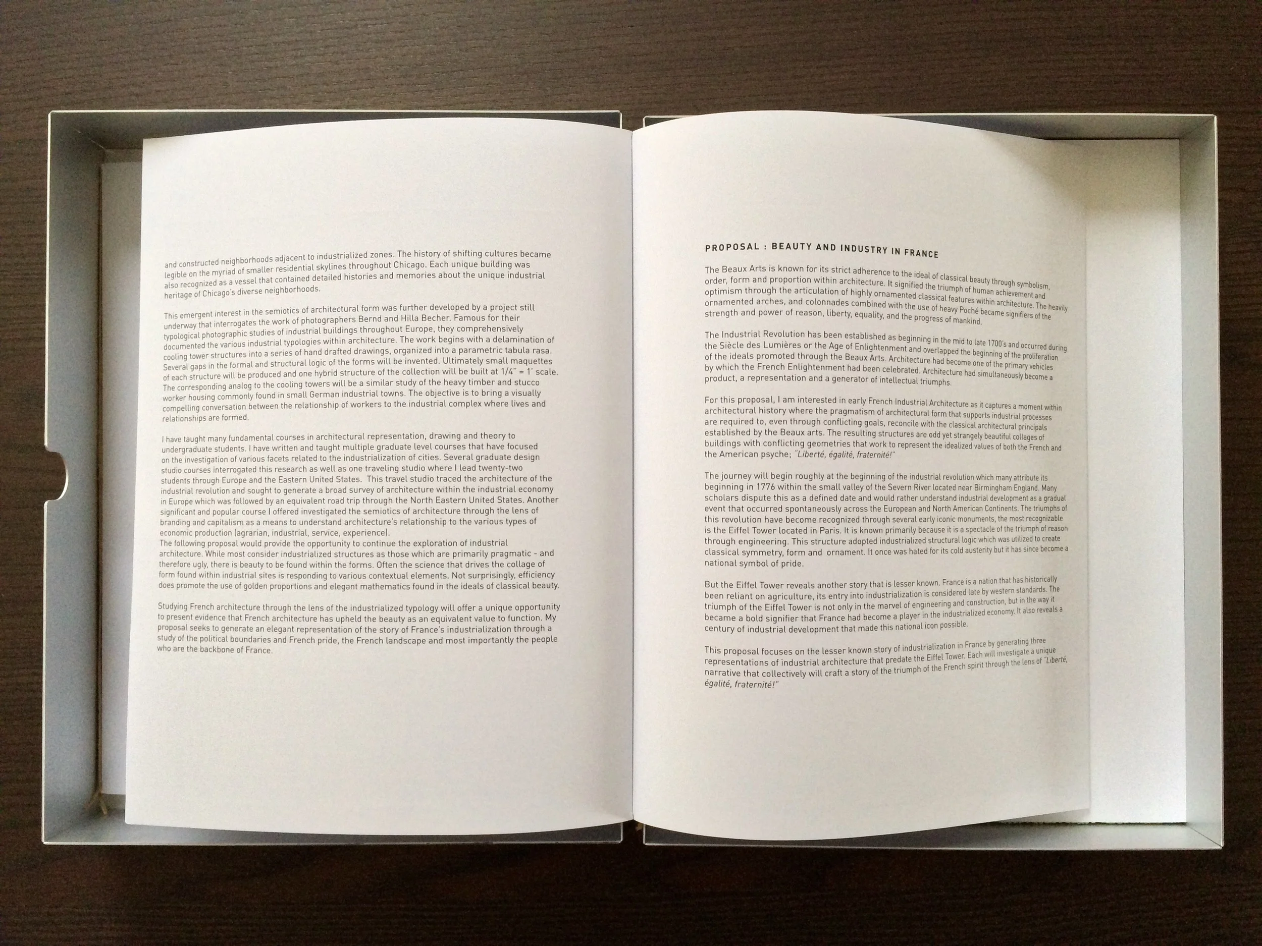
This small promotional piece was submitted for the prestigious Gabriel Prize Competition. The portfolio of work and project proposal were neatly enclosed in an aluminum box and secured with a contrasting jute cord. Understated design with minimal typography and generous white space allowed the content to be evaluated independently of the submission design but maintained the aesthetic of the artwork enclosed within the package. Digital submission was provided on a CD and a Flash Drive in duplicate.
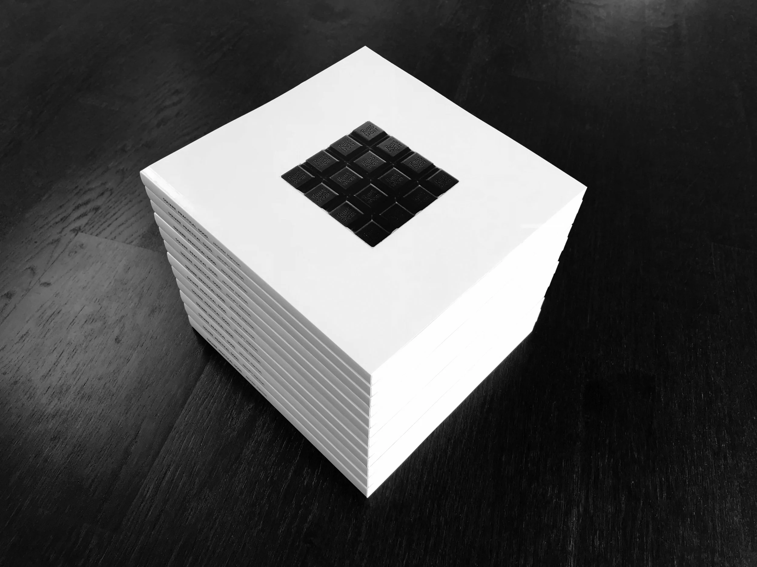
During one of my first job interviews in Germany, a potential employer explained to me that german culture can be easily described by a simple tagline found on the back of Germany’s favorite chocolate bars, the 9 x 9 cm wrappers clearly declare;
“Quadrattisch. Praktisch. GUT.”
“SQUARE, PRACTICAL, GOOD.”
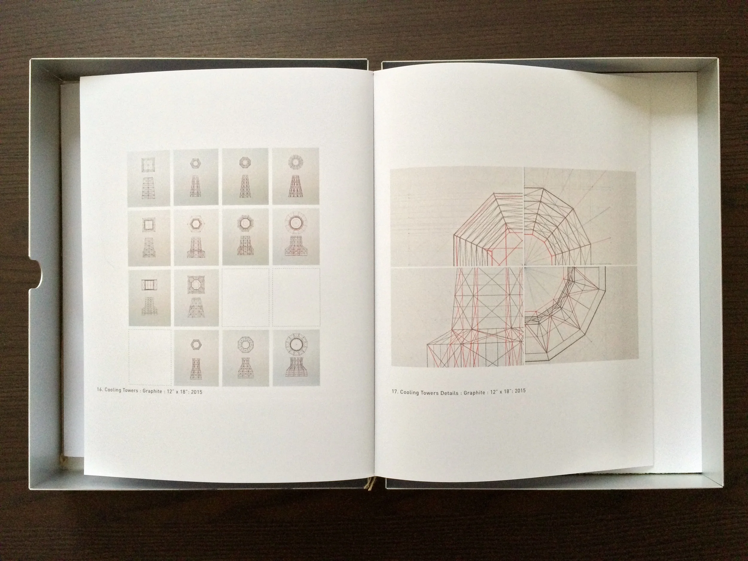
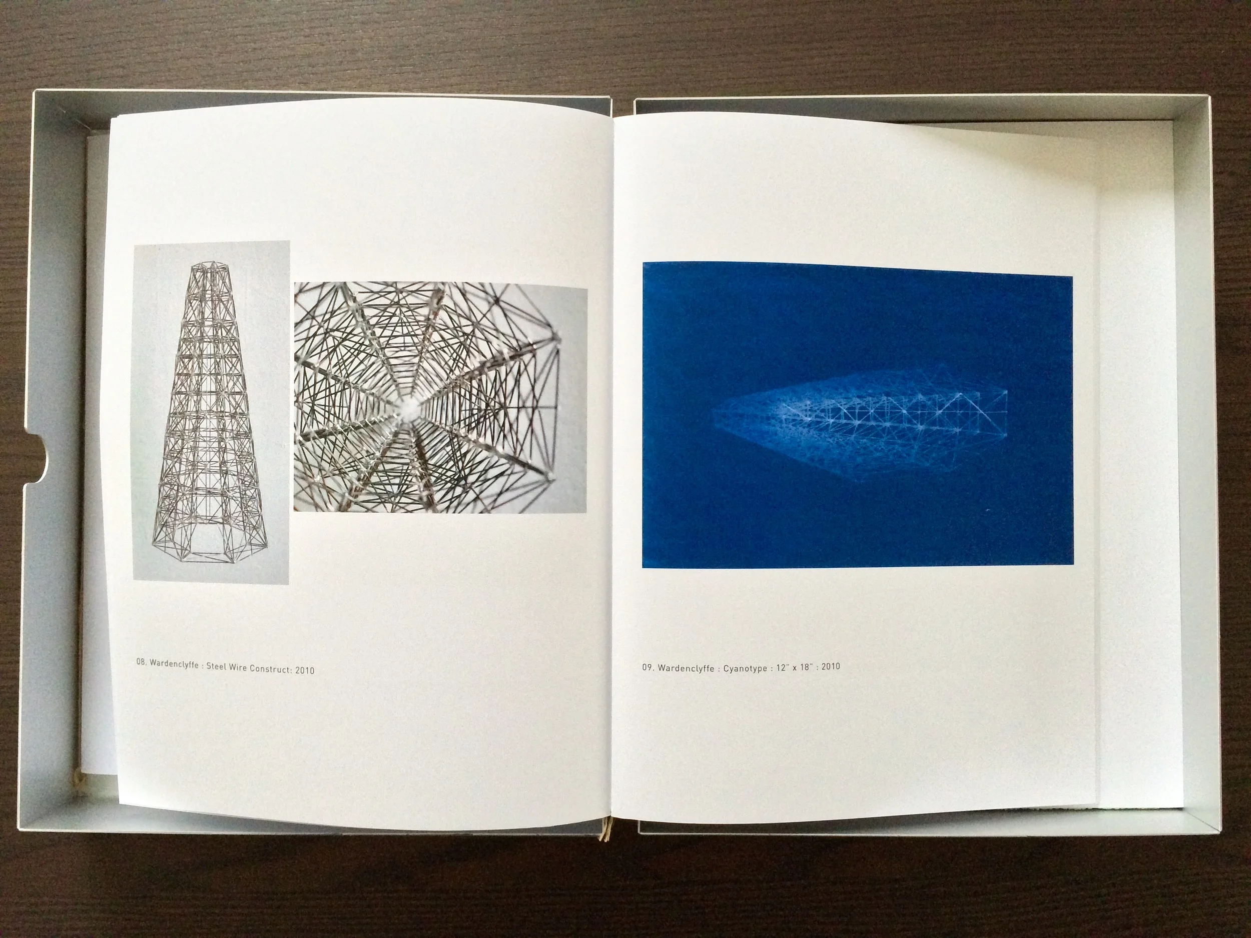
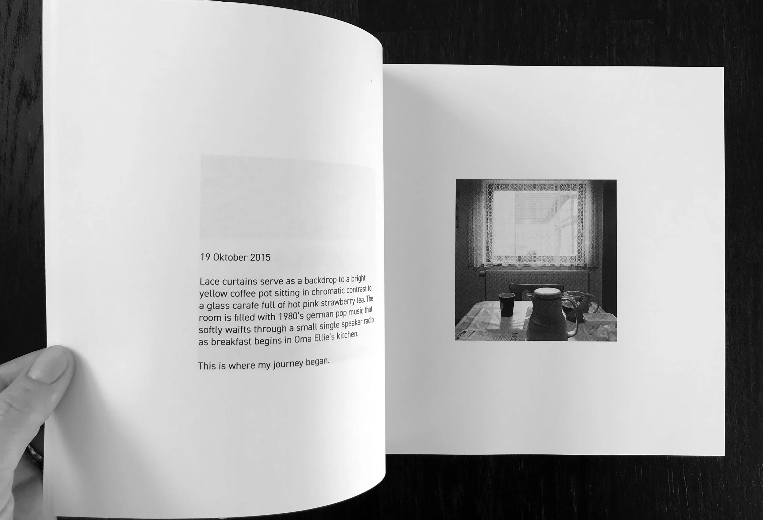
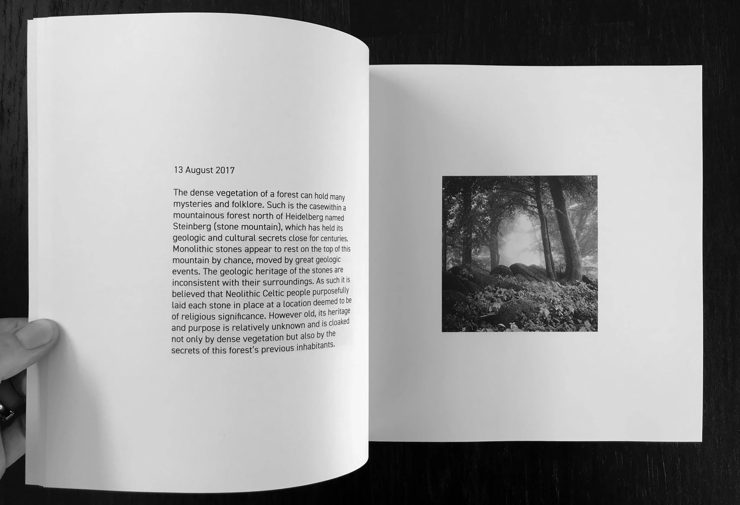
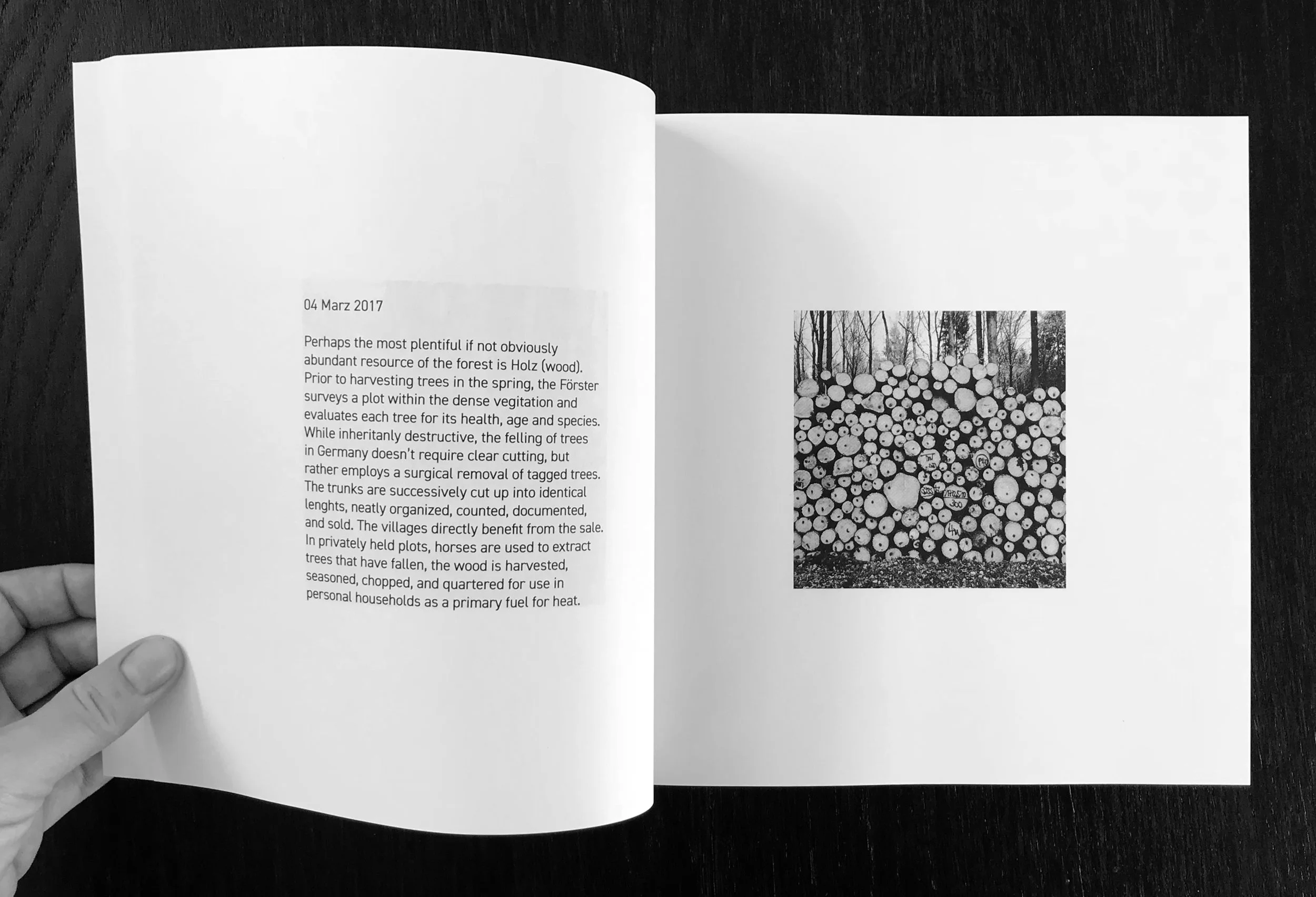
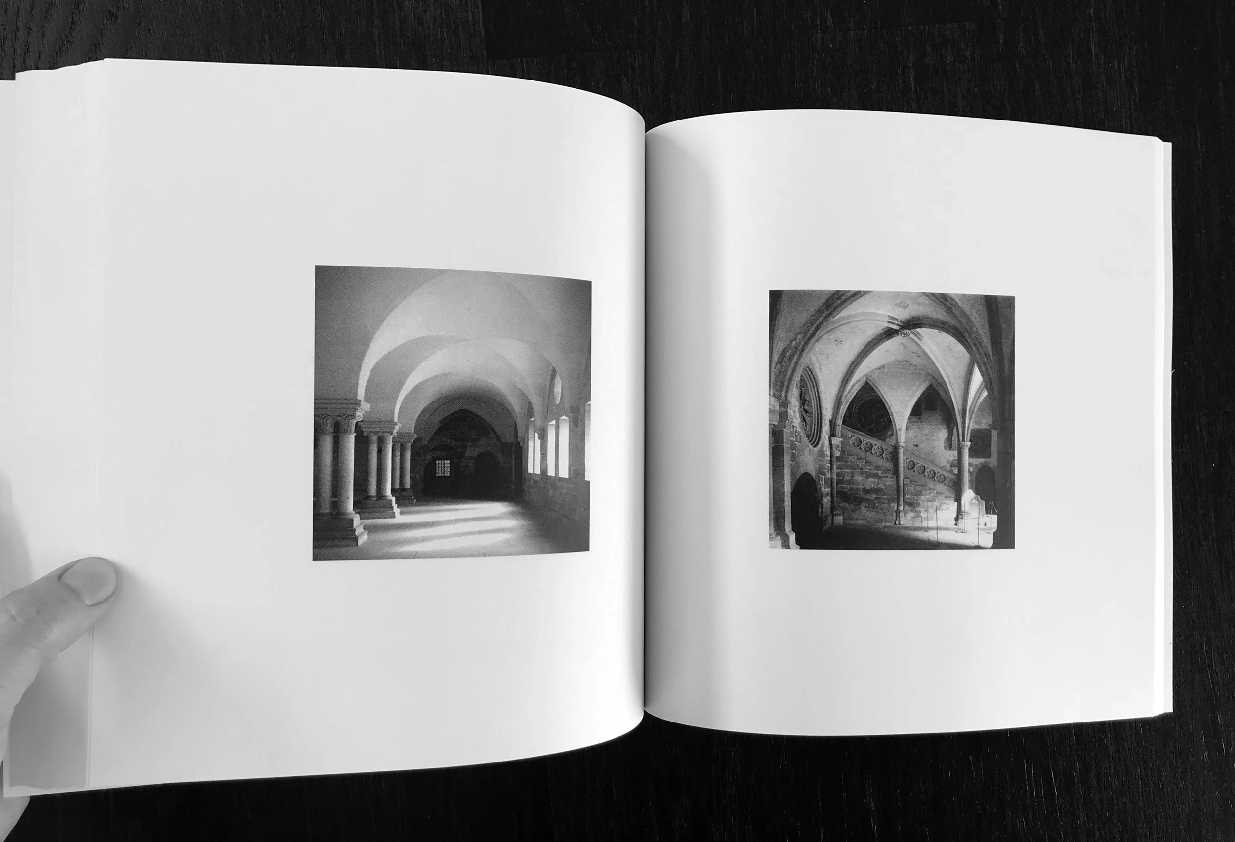
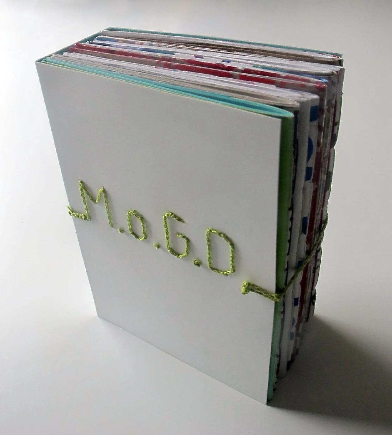
The visual record of my first two years living in Deutschland is provided through 9 x 9 cm portholes. Within these pages I have organized the images and my thoughts according to the conceptual lenses that have filtered my experiences. The book is organized into various typologies of function and space and attempts to organize my personal expansion as I began to understand the history, culture and architectural landscape in southern Germany.
There is no special photography employed, nor any spectacular feat of Photoshop. Only the small format that my ever present iPhone camera provided as my faithful visual recorder.
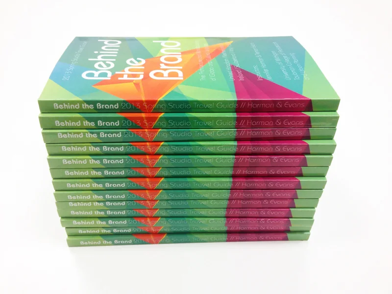
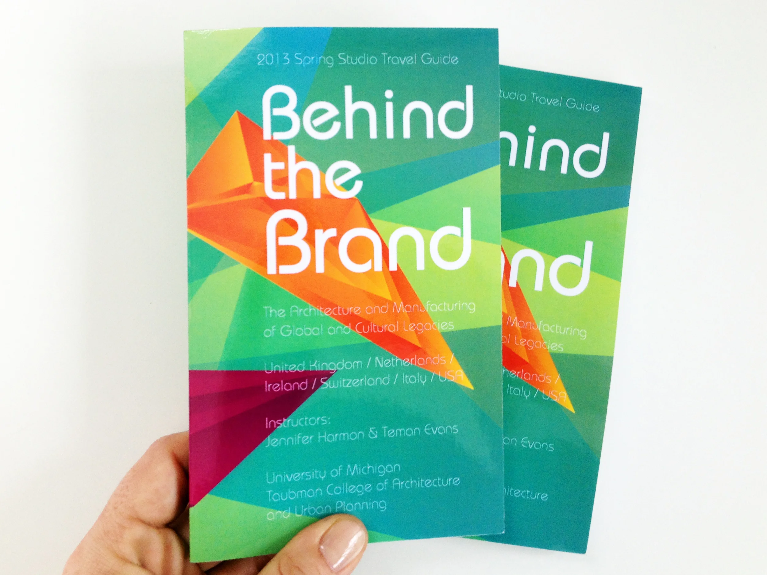
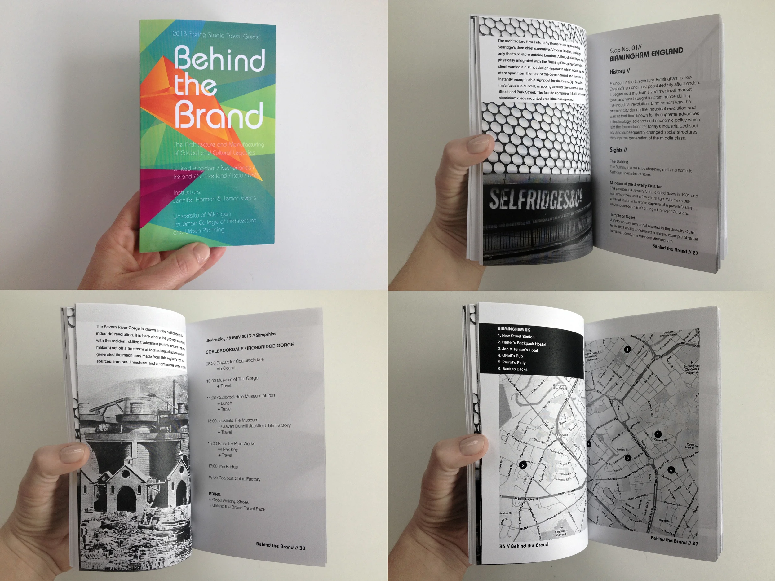
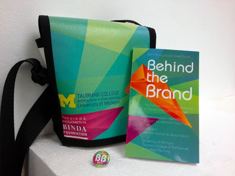
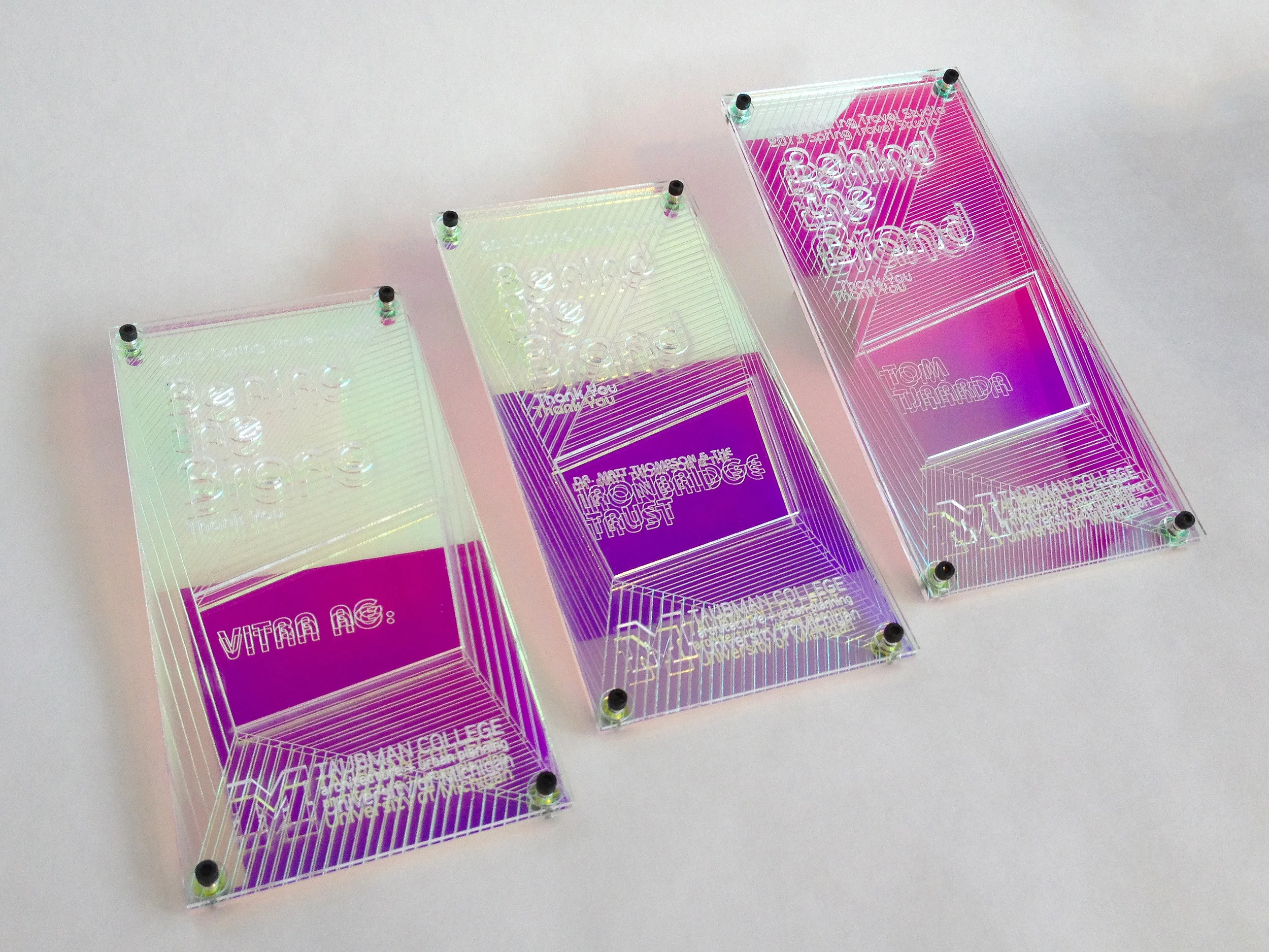
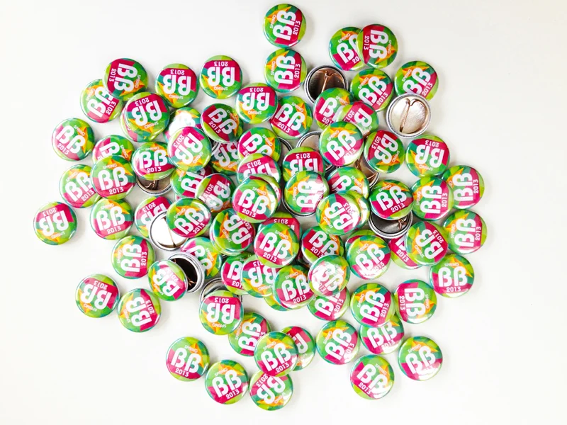
This book was designed and produced for a month long study tour for architecture students. Because of the ambitious itinerary of traveling to multiple countries combined with organizing 22 students, a traditional syllabus deemed insufficient. Each location was sequentially organized as a discreet chapter that included maps, a brief history of each location, a schedule for required tours and course meetings as well as a list of recommended sights for the students to visit in their time off. Large images relevant to the course topics were paired with interesting facts.
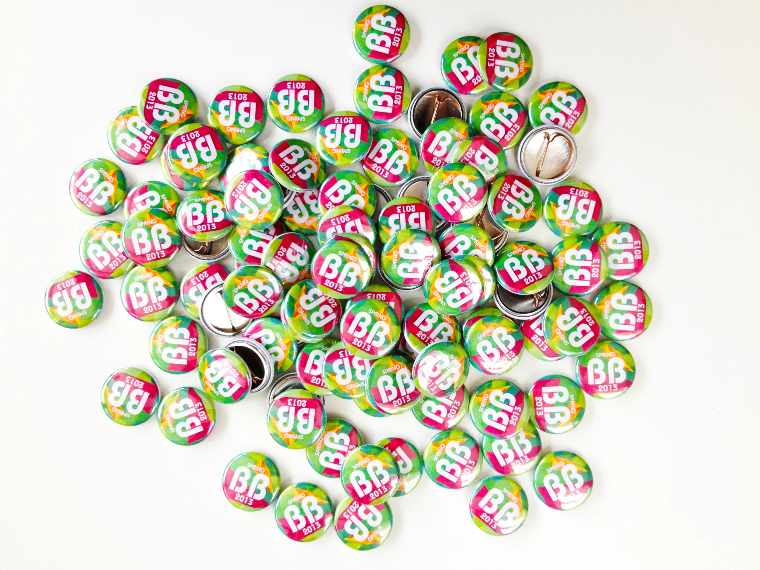
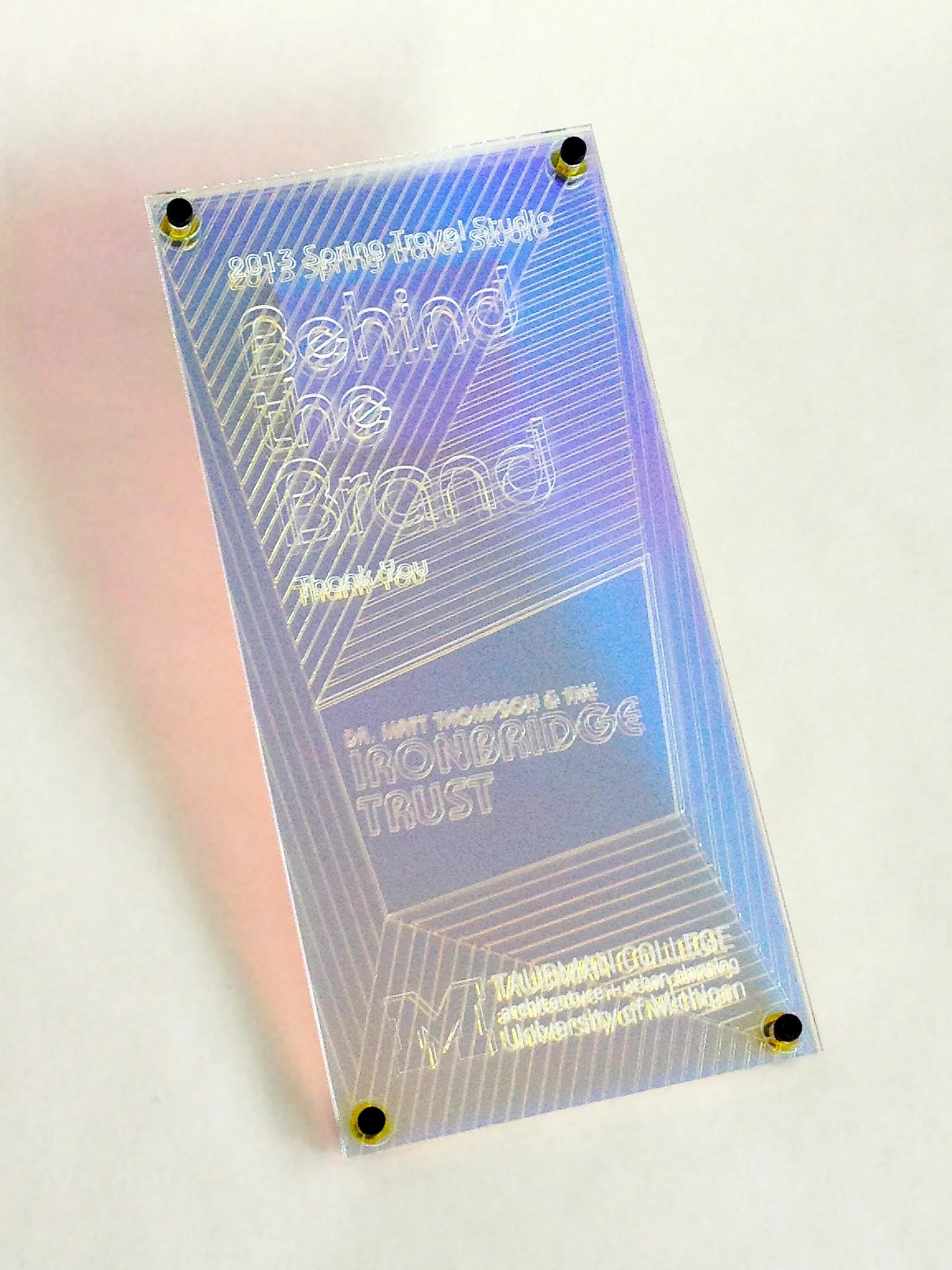
The cover design was generated by plotting point locations of each continent which were expressed by two colors, orange and magenta. The jewel-like islands represented the cities in Europe and North America yet are divided by the green oceans of color between. These brightly hued abstract faceted forms served as iconic visuals that were deployed across other forms of collateral that were used by the students and translated into plaques made of dichroic acrylic given to our hosts for their generosity.
http://bbtravels13.tumblr.com/
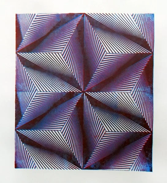
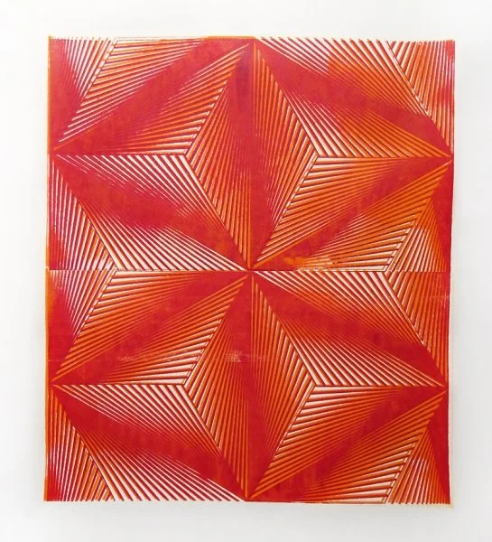
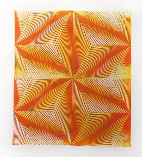
Duplicate print with intentional mis-registration
Medium Seriograph on Paper
Year 2012
Size 50 × 70 cm
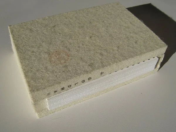
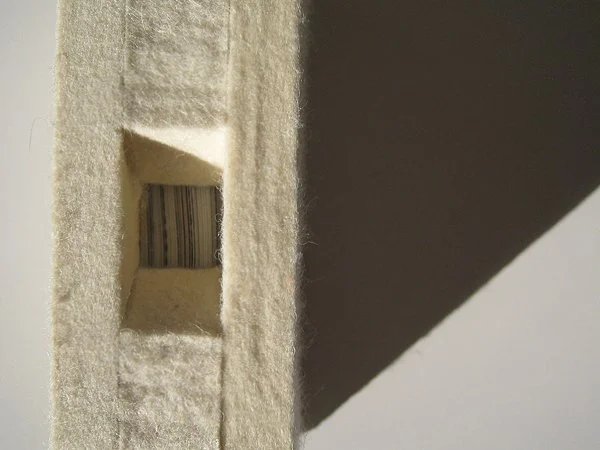
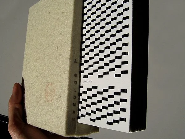
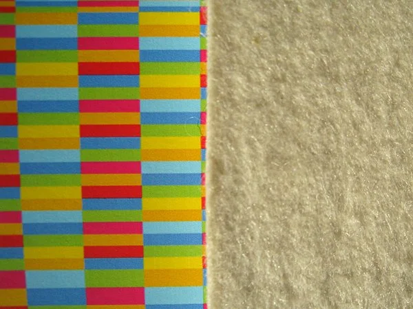
Developed as a part of a project acquisition, this book contained mood boards and project specific information. The visible endpaper designs were developed in Excel to visually demonstrate a connection between design and finance.
A5 booklet, industrial felt book jacket, signatures printed on inkjet on cotton paper, hand bound
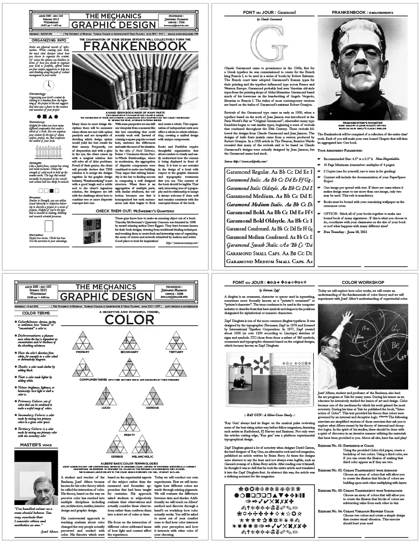
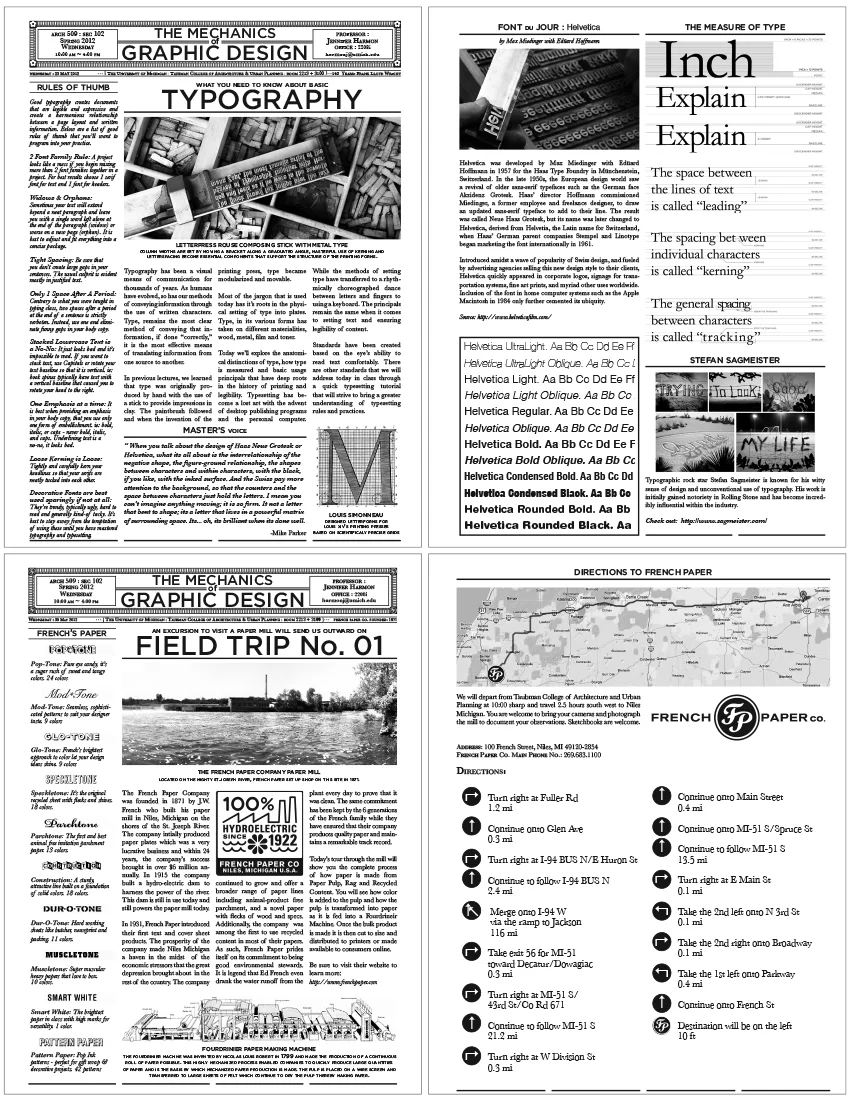
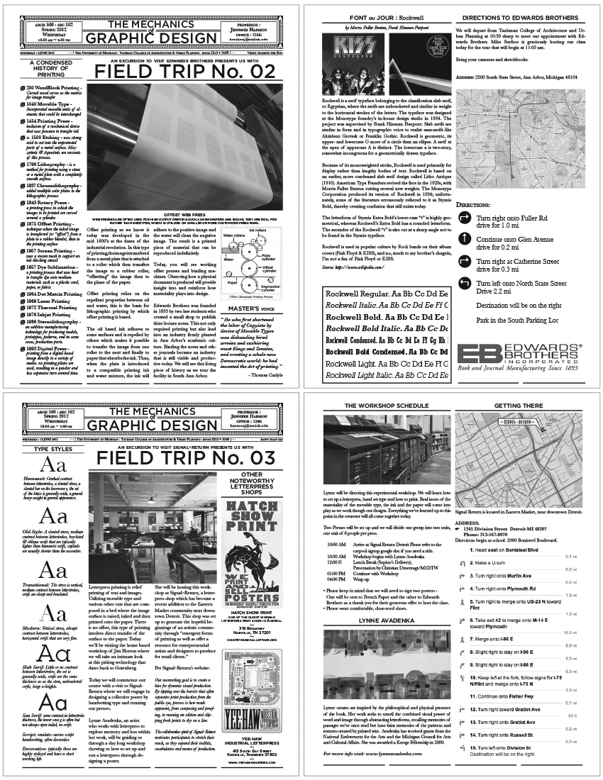
These handouts were produced for a course taught at the Taubman College of Architecture at the University of Michigan. The intent of the course was to give architecture students a six week "crash course" in the fundamentals in graphic design. Each handout represented a daily theme that was extensively documented in a hybrid newspaper/cheat-sheet format. The design neatly compartmentalized information, photos and diagrams representing sub-themes within each lecture and general topic while providing useful links and resources fur future practice.
The course was taught for three years, each year was printed on a unique sheet manufactured by French Paper Company that called attention to the materiality of the paper. The course focused on the materiality of graphic design. Students learned how to combine digital practices with physical methodologies. Three field trips demonstrated on the physicality of the production of design beginning with a trip to French Paper Company, followed by a trip to the letterpress Signal Return and bookended with a trip to Edwards Brothers where the students observed Offset Web Presses and a fully functioning bindery.
The students worked during the course of the semester learning how to serigraph (silkscreen) their own wallpaper for an architectural installation. The project was documented and formatted into unique booklets that were collectively bound.
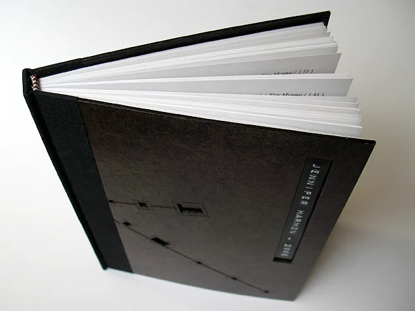
Five copies of this hand bound portfolio chronologically documented work produced between 2002-2005. The cover was crafted from laser cut hand polished book board.
5" x 7" x 1/4"
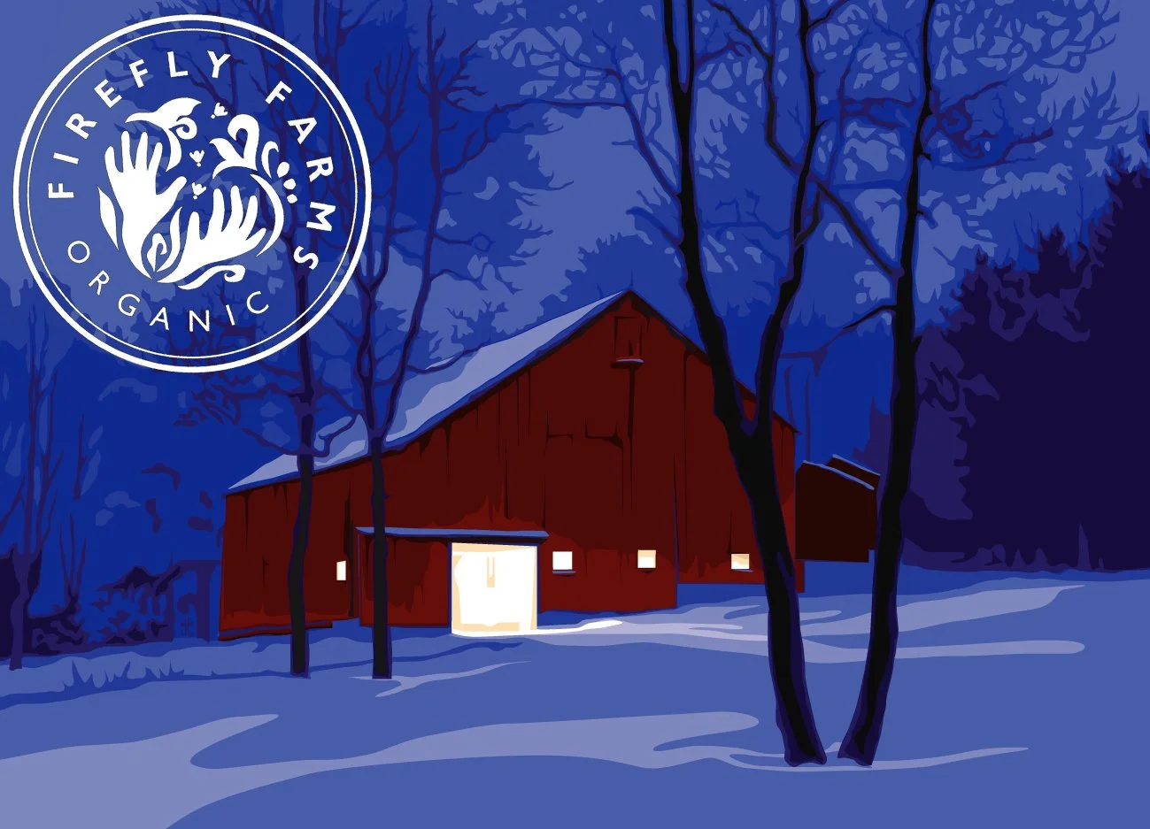
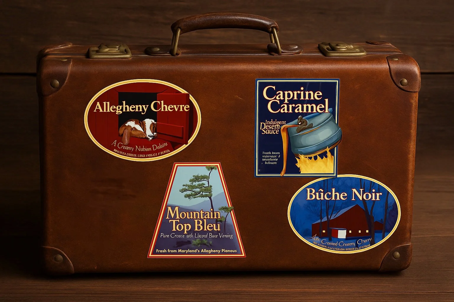
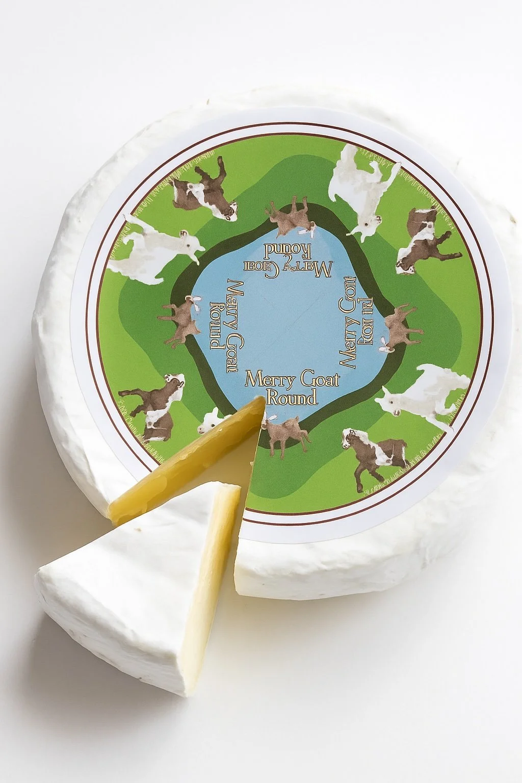
Maryland based Firefly-Farms' Artisanal Creamery was one of the first to open shop at the dawn of the foodie/gourmand/locavore movement that has swept the upper middle class of the educated American demographic. Upon acquiring their farm and the many goats, what was once a hobby quickly developed into a business. Firefly Farms needed to develop a brand that reflected their ambitions as worldwide travelers and adventurers who wanted to bring international styles of cheese craft to the United States market.
The illustrations and labels were designed after vintage luggage tags that hotels used in the early 20th century to mark the destinations of steamer trunks. While each cheese was developed based upon regional recipe abroad, they championed the local flavors of the Allegheny Mountain Plateau.
The creamery has expanded since these original labels were developed in 2000 as more products have joined the menu. Firefly Farms has won many awards for their distinctive products. Having tasted many of their cheeses and especially their Caprine Caramel, I can personally vouch for the quality and flavor of their product.
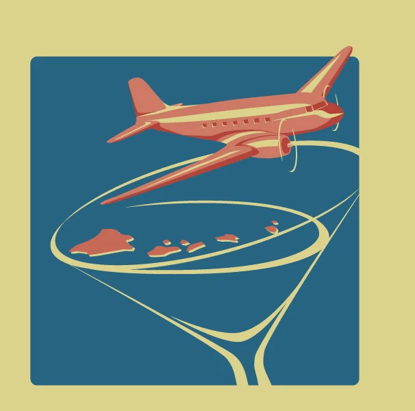
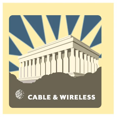
The Brittish multinational telecommunications firm Cable & Wireless operated globally. The Washington DC office served as the American headquarters. During the height of the Dot-Com boom, this office would host elaborate parties in various locations across the United States.
The two illustrations were produced under extremely tight deadlines. Each invite project was initiated four hours before the files were sent to be produced via offset press. Which meant, as the creative lead, I would conceptualize the theme of the party into a "cheeky" hyper-local invite. The two represented were generated for a Roaring 20's themed Martini Party in Hawaii and a Wine Party held on the lawn near the Lincoln Memorial in Washington DC.
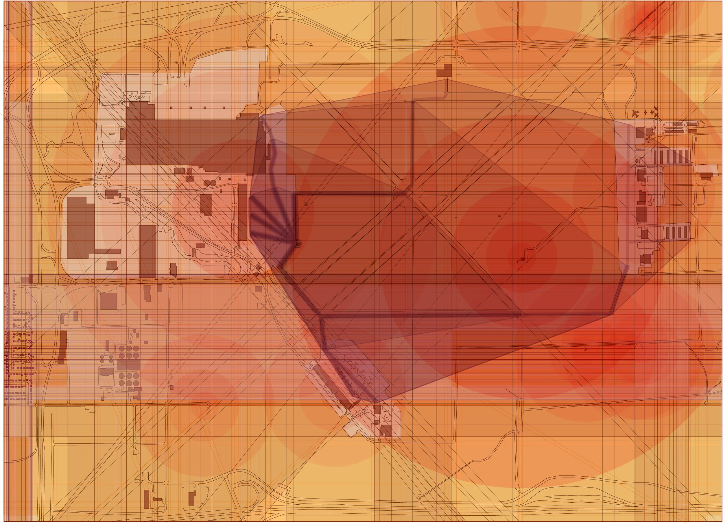
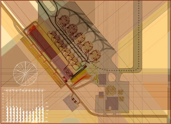
Detroit is experiencing a new era of economic growth which is attracting large businesses to reinvest in the city's infrastructure. Known primarily as the automotive manufacturing capital of the United States, its is also formerly famous for its role during World War II for producing the "Arsenal of Democracy". Large automotive plants were swiftly converted into factories that produced weapons of war, including tanks, land vehicles and airplanes. Willow Run, located in Detroit's suburb of Belleville rests between Ann Arbor and the Ford River Rouge Factory. This is where the iconic image of "Rosie the Riveter" was born and where the most prolific factory produced the B25 Liberators.
Willow Run is currently occupied by various companies. Namely, Ford Motor company has occupied the massive B24 assembly facility, while various other aviation companies have utilized the large runway and tarmac system to ship goods or create a secure and private location for private business jets can land and take off without the hassle of negotiating with commercial airlines and the general public.
In recent years, Detroit has been exploring various options for expanding public transportation that would enable the public to move freely between Detroit, Ann Arbor and Detroit's International Airport. They have proposed using existing rail and busses and have begun construction on a light rail system that will extend the city's existing inner loop monorail.
This speculative project proposes adding 10-15 miles of new passenger rail that provides direct access to both Detroit International Airport (DTW) and Willow Run. It also proposes the addition of a multi-use corporate center that combines a corporate meeting center, and enhanced private jet terminal with an intermodal shipping facility.
As Detroit seeks to rebuild itself and reshore industrial production, it can begin to reutilize and rehabilitate and expand the functionality of its extensive infrastructural network. Constructing the Aerotropolis of Willow Run will allow the city and the surrounding area will improve the current proposal of The Rapid Transit Authority's link between Ann Arbor, Ypsilanti and Downtown Detroit by making more robust opportunities for business growth.
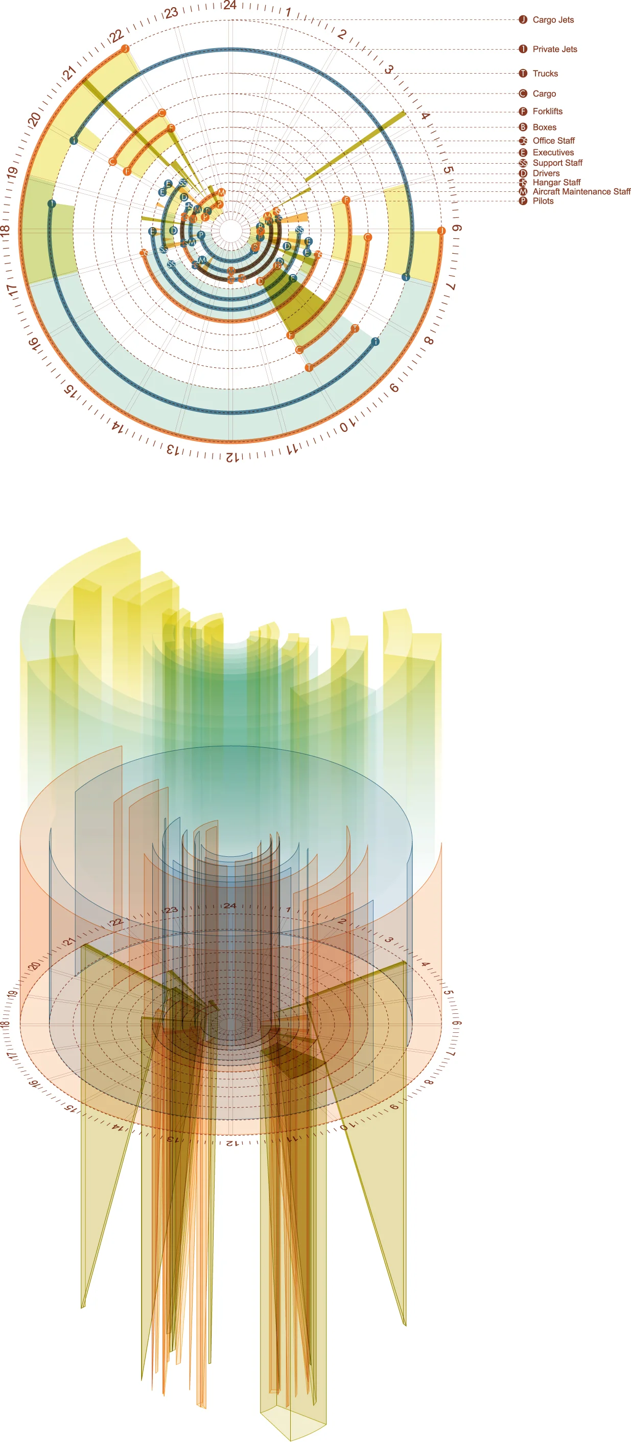
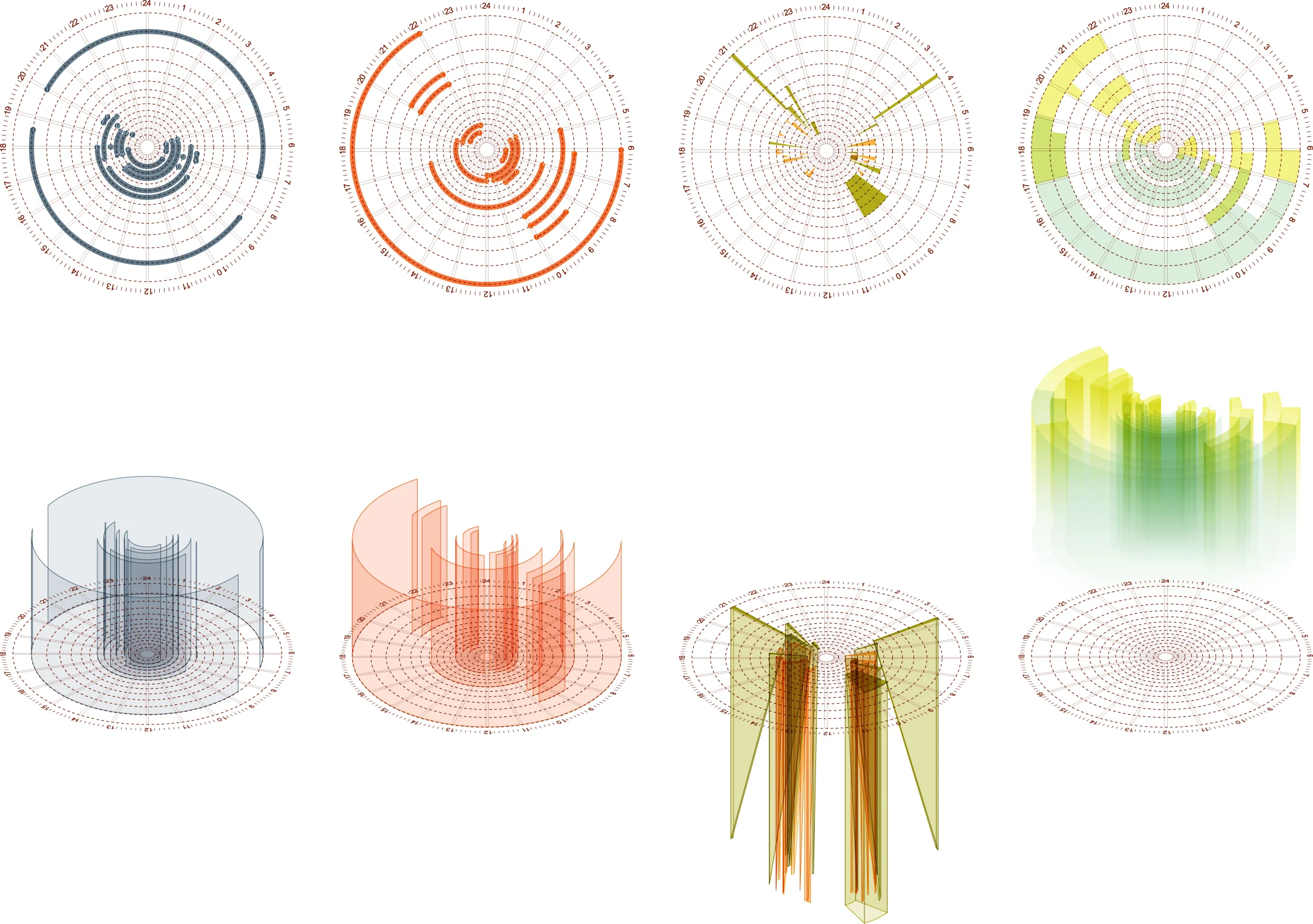
24 HOURS : Daylight : Program : Operations : Occupation
Site Analysis : Willow Run Airport
Site Analysis : Existing Intermodal Shipping Facility